Author: Blue Horizon
BUILD 1500
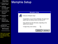
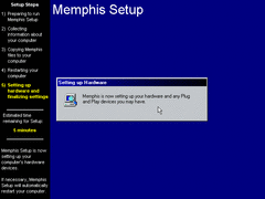
The fonts on the sidebar and top are different from previous builds, though otherwise nothing too different visually.
Also on the sidebar, extra minutes have been added to the ETA; suggesting they've implemented the timer in later phases of setup rather than being conformed to just the first. The red and green colored text is also gone.
Sure enough, the ETA is in later setup phases. Also, a different font is used for phase 2 of setup - presumably due to a font file not being loaded or included with the CD, though its normal when doing an upgrade. Why am I pointing out these miniscule details again?
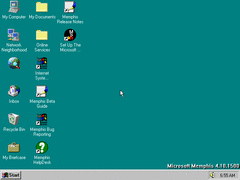
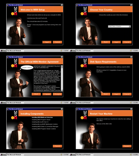
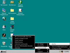
MSN has been given an overhaul according to its new shortcut icon on the desktop...
...oh look, it's the guy (apparently his name is Michael) from the MSN 2.0 Preview CD making poses during setup, as per usual. (https://www.youtube.com/watch?v=SZRJCeJhjLw)
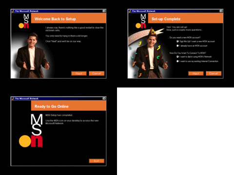
After an unexpectedly required restart; presumably due to reconfiguring IE, MSN is installed - complete with Michael celebrating and fulfilling his purpose.
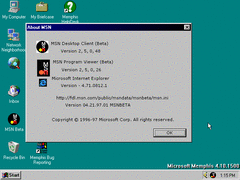
I briefly touched upon the MSN client in my review of NT5 build 1729, though here I feel like I'm able to cover it in greater detail since its more commonly included across Windows 9x builds, which makes sense since it was a consumer oriented application.
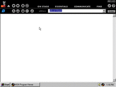
And this is the MSN browser. It's basically IE with more eye candy and sound effects for the toolbars thrown in. Should you be curious, here's the ZIP containing all of the MSN assets - as well as the included MIDI file recorded using OPL synthesis:
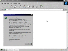
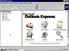
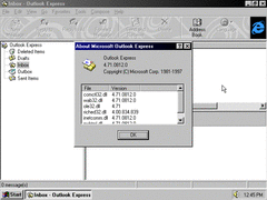
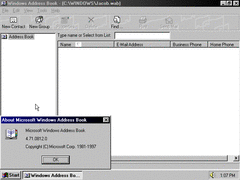
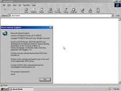
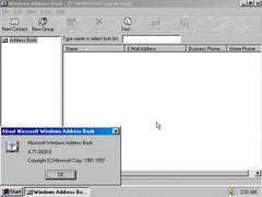
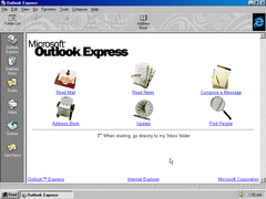
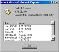
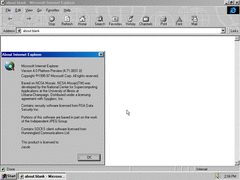
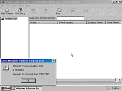
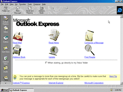
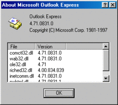
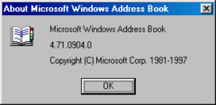
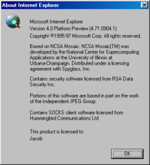
IE itself is also updated - along with Outlook and Address Book; all of which having slight UI tweaks. Be prepared, cause I'm going to be repeating the process of showing these three programs through the other builds: Having newer version numbers every passing build.
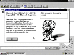
The first actually new thing in this build I can add here besides MSN is that Microsoft Chat is included for the first time.
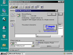
In the backup utility, the Seagate logo is now shown as a clickable button rather than just a static image.
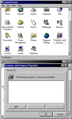
The Scanners and Cameras applet has another new icon.
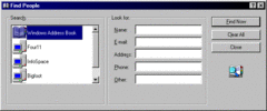
As with Address Book, "find people" is also given a new icon too.
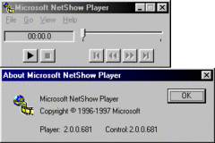
Lastly, there's NetShow Player meant for Microsoft's proprietary audio/video container format, mainly used for streaming media.
BUILD 1511
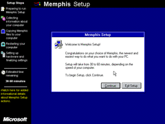
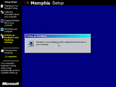
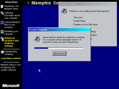
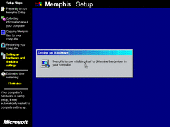
In terms of visuals, there's the MS logo on the bottom left, six new icons next to the steps and ETA timer, and the "Memphis Setup" text at the top has a flag next to it in front of a black banner.
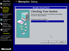
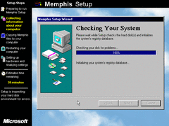
A new step in setup named "Checking your System", as it implies; now checks your hard disk and also initializes the registry should an existing Windows installation be present.
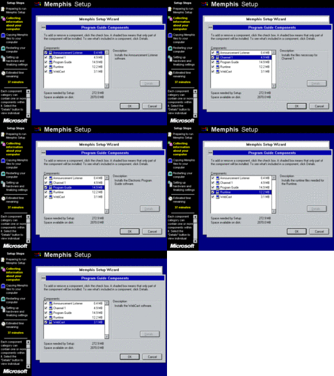
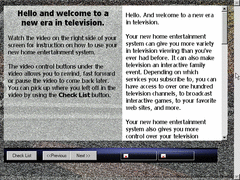
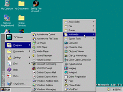
In the components list, a new set of programs dubbed "Program Guide" contains various stuff related to web television. Presumably this is an early iteration of WebTV for Windows.
The Windows 95 style progress bar has been done away with in favor of one conforming to the sidebar where the description box usually is.
During second and third phases of setup, you'll notice a new choice of gradient colors for the title bars, as well as some of the text during the 2nd phase having the Tahoma font for presumably the same reason mentioned earlier.
Upon first starting up in 256 colors, there isn't enough shades of blue available to display the gradient to its full potential - as the latter color matches the background. Probably another reason why Windows 98 doesn't allow gradients to be displayed on anything less than 16-bit colors.
Moving up to a higher color depth; the gradient colors are the same ones used in the final build, among others.
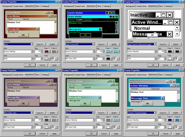
Two new high contrast themes (#1 and #2, plus their large and extra large variants) make their debut here, along with many of the existing themes now having an official second gradient color too! Most of the secondary colors for those themes were excluded from Windows 98 and beyond, and returned to just being one solid color entirely.
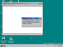
When logging in for the first time, this dialog briefly appears configuring TV Explorer. Of course, it only installs if you've selected it from the components list during or after setup.
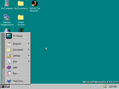
Actually, it's called 'TV Viewer'. They even promptly place it at the top of the start menu too.
Well... It does look like an early version of WebTV, albeit with missing assets. I really don't have much else to say about it - so to make this quick and short, here's a walkthrough of the TV Viewer setup wizard in this build:
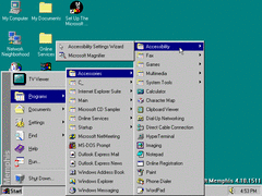
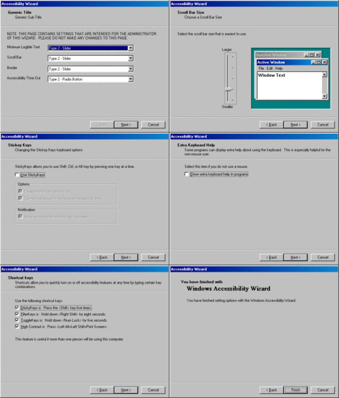
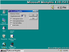
Also in the start menu is a new folder consisting of the accessibility wizard, and the now standard magnifier.
There's not much different here compared to the one in some of the earlier NT5 builds, so I don't really need to add anything here - though I will say that the wizard seems to be a lot more stable here than under NT5.
The magnifier in all its desktop hogging glory. It does have some stuff missing from later versions like switching to the high contrast scheme, though otherwise it works just like it does in 98.
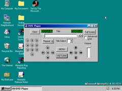
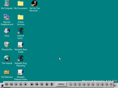
A DVD player is included, having a slightly schizoid interface to boot. Either way, It's safe to assume its incapable of playing back discs that make use of more recent DRM encryption methods or have non-matching region codes unless you first remove any copy protection from the disc. Even then, you'd likely be better off using a 3rd party DVD player like PowerDVD or WinDVD.
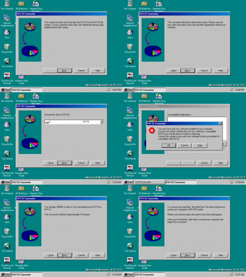
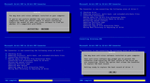
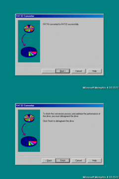
FAT32 converter is now a full-fledged wizard; being a lot more polished out with checking for any incompatible programs and giving you the option to back up your files.
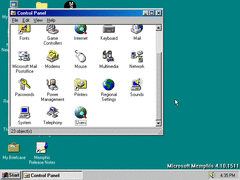
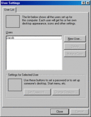
Moving on to the control panel, Scanners and Cameras has been removed entirely, along with a new applet named Users which doesn't seem to be functional here along with Game Controllers.
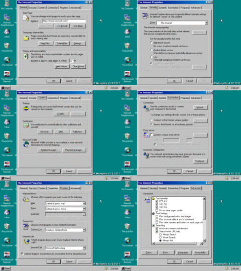
The interface in internet properties is mostly stuff rearranged and renamed.
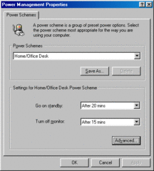
Power management is also given a facelift, giving the user a much more intuitive way to set how many minutes before standby and turning off the monitor.
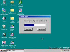
Automatically putting the system to sleep is also functional, though one weird thing I noticed is that as soon as the dialog appears, it goes to sleep early. And when the system is "awoken", the timer then casually finishes as if nothing happened.
The shortcut to 'Public Documents' is removed alongside the actual folder from the root of the drive.
IE 4 and Address Book have been updated mostly consisting of minor UI tweaks.
Outlook Express has a completely new look to it in the form of the sidebar, looking very similar to the one from Outlook 97.
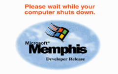
This build goes back to using the older LOGOW.SYS shutdown splash screen from earlier Memphis builds, for whatever reason. All that out of the way, here's the new release notes and guide included here:
BUILD 1513
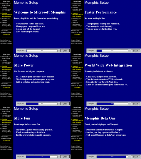
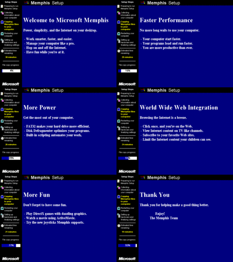
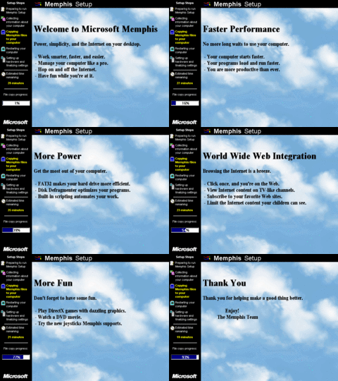
Nothing much new pertaining to the setup slides besides correcting punctuation and spelling mistakes.
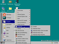
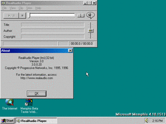
It's not too often you see Microsoft themselves include third party programs with Windows, at least back then. This build comes with RealAudio Player 3.0.
For the sake of completion, here's the original .RA 'welcome' audio file it comes with converted to WAV:
I don't need to explain this part again - I'll spare you the repetitiveness.
'Find people' has a list of internet-related services, along with buttons pertaining to each service that directs you to their respective sites.
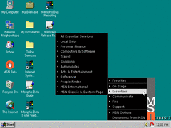
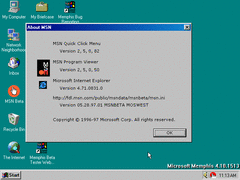
MSN Quick Click Menu (that's apparently what its called) adds more menus to browse from.
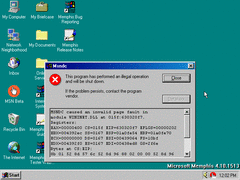
Letting MSN run for more than 5 minutes crashes it outright. How charming.
The TV Viewer setup has most if not all of its assets intact this time, so here's a more complete walkthrough of it.
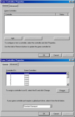
The Game Controllers applet of course allows you to connect any compatible controller like the SideWinder, as well as calibrating button presses from it.
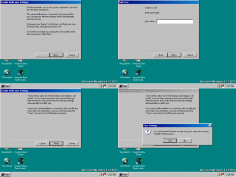
The users applet also works, so I can show that off here too: You can add numerous users to this list along with assigning them their own passwords, start menu, personalized desktop themes, etc. Always a useful thing when multiple people use the same machine.
BUILD 1518
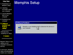
The fonts are different again during 2nd phase of setup when doing a fresh installation.
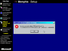
Even during setup procedure, IE 4 has to cough up bugs...
You should be familiarized with the drill at this point.
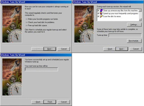
Included in the Windows folder and on the CD itself is a tune up wizard for optimizing performance as well as fixing and freeing space on your hard disk. The wizard is unfinished however, as the buttons for rescheduling and changing settings don't work at all, and it doesn't schedule a time either.
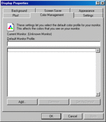
Color management has been brought out of hiding from advanced display properties and is put back in the main display properties menu.
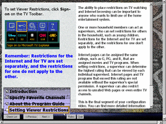
TV Viewer setup is now stripped down to four steps, along with it still being incomplete in terms of functionality.
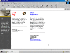
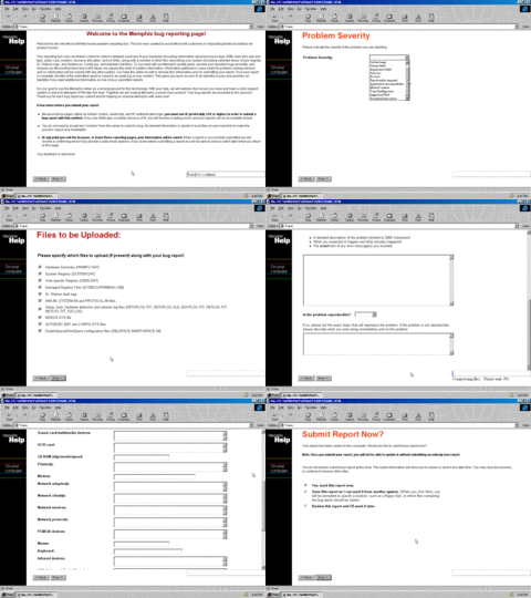
A new Windows Help page consisting of both local and online resources is present, including a link for filing bug reports only exclusive to those who are on the Memphis Beta Program.
And here it is, in 1024x768 resolution so all or at least most of the text and dialog can be displayed at once. Pretty self explanatory, though its funny how they refer to a Pentium CPU as a 586, cause that's basically what it is.
This finally concludes this lengthy breakdown - and finishes off what I'd consider to be the 'golden age' of Memphis development. I say that because unfortunately after this; Microsoft decides to focus its efforts more on heavy web integration, rather than simply improving upon the fundamentals of the 9x kernel while still preserving the simplicity and usability of the Windows 95 shell, plus the additional UI enhancements which don't need to rely on IE to work. I'll still continue to make build documentations, but keep them in quarantine when finished until I feel like posting them to ease the flow and process of adding and creating them.
