Author: Blue Horizon
Here it is. Probably my biggest review to date. From here on out we're going to most likely face a lot of bugs. There's just so much new stuff in this build I probably missed some. But regardless, let's go ahead and look at the primary things that we're changed.
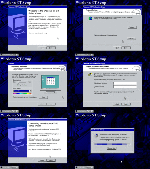
Setup has been completely revamped, probably cause wanted to make it easy for a novice to install. For the most part this behaves how it would in the final build. There we're 13 screenshots in the setup alone I had to make them into a GIF to show it all in one sitting. This setup wizard features new things such as:
- The wizard now has new bitmap banners on the side and top
- Setup configures and installs devices during setup
- New icons and redesigned wizard dialogues
- Wizard now includes a step for setting up your resolution and color depth
- Also includes a step for setting your time zone and date
- New copy progress dialogues (although the last one has a smaller window than the final)
And it also looks like there's a new command prompt icon as well. This style of the icon is still in the latest version of Windows today.
 (PNG)
(PNG)
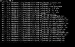
During the OS Loader, it now shows information of what files are loaded in what directory. This probably predates that "Starting Windows..." progress bar at the bottom.
 (PNG)
(PNG)
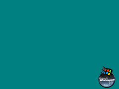
There's now a new watermark when logging in. It says "Beta 2" even though this is still Beta 1. Again with artificially bumping numbers up.
 (PNG)
(PNG)
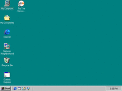
There's now some new icons on the desktop, such as Outlook Express (which doesn't seem to have an actual icon), and MSN. The clock also appears to be centered when no system tray icons are present.
 (PNG)
(PNG)
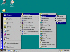
The start menu has been slightly changed. It now has shorter buttons depending on how long the text is. Now, why is that?
 (PNG)
(PNG)
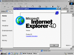
Oh, of course it's IE 4. With IE 4 being updated to have that webby about window it's a sure sign that IE has taken over Windows. The developer credits easter egg also works here.
 (PNG)
(PNG)
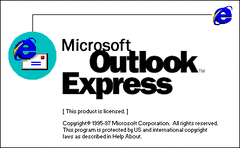
Of course, I can't talk about IE without Outlook Express.
It now gives you two emails with advertisments, and it's apparently version 5.
 (PNG)
(PNG)
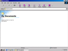
And the explorer... It looks just like Windows 98. Although this is only temporary as it's replaced with a newer style of explorer later on.
 (PNG)
(PNG)
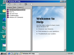
This build now includes HyperHelp, which is a component of MSIE. Windows 3.0 had a similar help system with hyperlinks, but at least that wasn't a full fledged web browser.
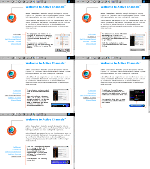
The Active Channels tour is changed with the new IE 4 update.
 (PNG)
(PNG)
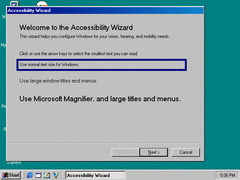
The accessibility wizard is differet and is like the one in Win98. This is like the sourcery for those simplified dialogue boxes in Vista and 7.
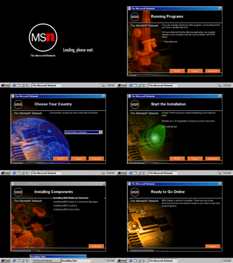
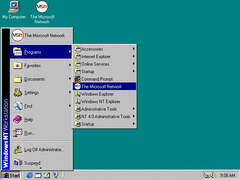
The MSN icon on the desktop brings you to this visually appealing setup process. Of course, this doesn't actually work anymore cause of defunt websites.
 (PNG)
(PNG)
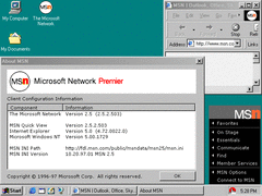
After installing MSN it promptly puts shortcuts on the top of the start menu and in the programs menu. We'll, at least it isn't in the quick launch... for now.
 (PNG)
(PNG)
When you open MSN, it asks you to choose your method of connection. It then places itself in the system tray with it's own style menu that's used in certain Microsoft products. It even has the MSN logo in the throbber of the browser.
And to end it all off, here's a little inside joke they have in the fax properties.
So far these visual improvments are alright, but those could easily be done without IE. There is more stuff I didn't show you in this build, but there's too much to show off at once I might as well end it here for the time being. There's still much more to get through and we haven't even left beta 1 yet. So stay tuned for more.