Author: Blue Horizon
I guess I've been on a long enough break now after finishing the Windows XP development series, but time to get back to work.
This time we'll be taking a look at the development of Windows 2000 starting with build 1515, and comparing this build to Windows NT 4.0 RTM/SP1.
Windows 2000 officially did not have a codename. Dave Thompson of the Windows NT team says that former MS exec Jim Allchin disliked codenames. Reportedly sources say that the 64-bit version of Windows 2000 was actually codenamed "Janus", which is the same codename for Windows 3.1.
With the backstory out of the way, let's dive right in and see what new bloatware awaits.
The setup still looks like Windows NT 4 (and in some aspects Win95). The only difference that I can note here is that the font is Tahoma rather than MS Sans Serif.
I should also mention that trying to install this build was nearly a nightmare. First I had to copy all the I386 files to the hard disk, then run WINNT.EXE /B to bypass the 3 installation disks, and I also had to disable ACPI in the BIOS. If I didn't follow these steps exactly, setup would BSOD on me.
Indeed, the boot loader is upgraded to V5.0.
Like previous versions, you have to logon with your username and if you prefer, a password. And of course the Tahoma font is all over the place.
I found this minor feature not in NT 4 even with SP6a, apparently there's an advanced logon method to choose from.
Of course when you first boot up this build there's bound to be driver errors. It doesn't even say what it's trying to install. Thankfully you can shut them up permanently.
And... Wait a minute... It can't be...
You've got to be kidding me.
A webpage as a desktop background. Keep in mind that this build was compiled in March of 1997, IE 4 was released in September of the same year. It's clear this new version of Windows NT wouldn't let you remove IE at all.
This is interesting, at least to me. In the Windows NT Help they show "Windows 95" on the start menu rather than "Windows NT Workstation". And no, this mistake wasn't actually made in NT 4.
A screensaver as a WEBPAGE?! The world is really coming to an end!! Please stop the madness, Bill.
This build also adds gradient colors in title bars both active and inactive. I don't know why they wouldn't show off that from the moment you installed this with appropriate video drivers, but this is after all the earliest known build of Windows 2000.
The explorer of course is changed. It may look like it's just a checkerboard patern, but if you actually downscale the image you can see spherical network planets.
Interestingly enough when I tried to remove the title bar to make it look more like 95, the whole explorer just froze and that one directory just freezes on me when I access it.
Also, I do have high color icons working. I'm gonna be pretty much doing that in every build I review to see what they're like. You can find out how to get high color icons working here: http://www.todaysgeek.50webs.com/win95256colers.htm
NOTE: If you want these high color icons in 95, you can install Plus! 95 and it should install that string value key automatically.
IE 4 Beta 1 is different from the final as it has those same spherical network planets in the background of the buttons, making it look a lot like IE 3 with it's swirly background buttons.
The Comic Sans font is now included with this build, interestingly NT 4 didn't have Comic Sans by default. I guess they didn't want to make a "New Technology" OS look childish to professionals.
Also interesting is instead of "The quick brown fox jumps over the lazy dog.", there's this comical sentense (No pun intended). Also, where's the 7?
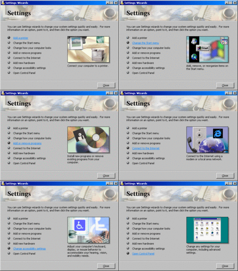
In Start > Settings, there's this settings wizard with 8 options that basically are webby links that lead to things that could be done without the wizard. They just got to get consumers by the balls with colorful bitmaps and hyperlinks.
There's also ActiveMovie Player which looks just like Media Player while it's playing video files.
In case you're interested, here's the gifs of the active desktop.
Finally, this build now adds the ability to log out of your computer and switch users. I'm not sure if that's in NT 4 with SP6a, but that's still a nice feature.
So as of this build, is it worth the upgrade yet? No. You could already install IE 4 on NT 4 and have the Active Desktop as well as install the Comic Sans font as well as update Media Player as far as version 7.0 (7.1 can also be installed unofficially). While the gradient title bars look nice, this build mainly just focuses on form over function.
But after all, this is just the earliest build. We still got a lot more ground to cover. Stay tuned.


