Author: Blue Horizon
Once again, I don't have much to say here. But I will show you the OOBE which is like the one in Windows ME.
 (PNG)
(PNG)
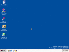
Same desktop. Nothing to comment on here.
 (PNG)
(PNG)
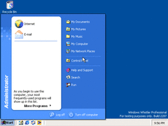
Same start menu. Although they did fix a few graphical bugs.
 (PNG)
(PNG)
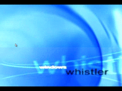
The OOBE. To get this, you have to open Command Prompt and go to the OOBE directory (C:\WINDOWS\system32\oobe). Once you're there, type in "msoobe /f" and press Enter.
 (PNG)
(PNG)
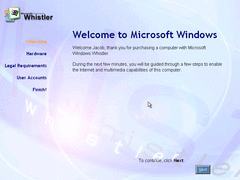
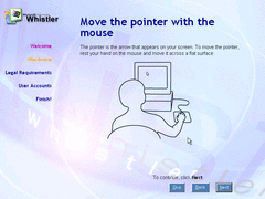
Well... It looks just like the OOBE from Windows ME just visually changed.
 (PNG)
(PNG)
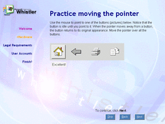
And it also gives you a tutorial of the mouse. Kind of useless since you probably just used the mouse to start the tutorial in the first place!
 (PNG)
(PNG)
Ooh, "Excellent"! As if just learning to use something that has existed since 1968 is worth being applauded for.
 (PNG)
(PNG)
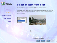
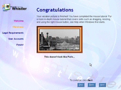
Paris? We'll actually, that is the Louvre Pyramid. Why not use something more familiar like the Eiffel Tower?
 (PNG)
(PNG)
And of course it congratulates you for using a puck with two buttons and possibly a wheel. Packard Bell had something similar called Navigator, and it actually provides useful info like not sticking the mouse up your nose.
 (PNG)
(PNG)
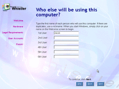
While the previous things I showed we're all from Windows ME, this is actually new. This part of the OOBE allows you to create multiple users like in the final version of XP. Don't know if it actually works.