Author: Blue Horizon
Honestly, I don't have much to say about this build, other than the fact it's more stable than the previous one.
There's still some interesting goodies so I might as well show them.
 (PNG)
(PNG)
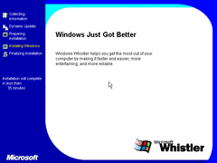
Microsoft has yet again redesigned the setup screen. This time with a time remaining counter.
This also reduces the amount of wizard windows you have to go through.
They also removed the express setup option in the first part of installation, and just going with the custom setup like usual.
 (PNG)
(PNG)
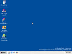
On the desktop, we have two new icons (excluding the internet connection wizard).
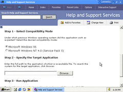
We now have an icon that takes us to something MS was testing at the time, Compatibility Mode.
There's also an icon to Windows Media Player, we'll get back to that in a moment.
 (PNG)
(PNG)
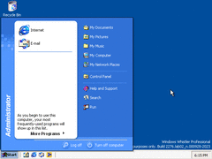
The start menu is slightly different, as it now displays the username. Of course, this was already showcased in a previous build.
 (PNG)
(PNG)
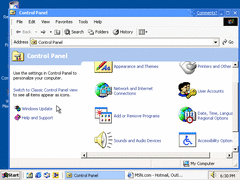
The control panel is now more like the final version other than the icons. Of course, you can switch to the classic view if desired.
I didn't feel like taking a screenshot of it, but Speech now almost works. I couldn't get Microsoft Sam to say certain stuff, only stuff that doesn't require much time to say.
 (PNG)
(PNG)
Clicking the first icon on the desktop I told you earlier takes you to this page where you can test a program designed for Windows 95 or NT 4. Since this is the first apperance of this, I doubt it works that well. Then again, compatibility mode is kind of useless as it is nowadays considering you can use virtual machines to run older operating systems.
 (PNG)
(PNG)
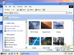
The pictures from Windows ME are added. Nothing more to say.
 (PNG)
(PNG)
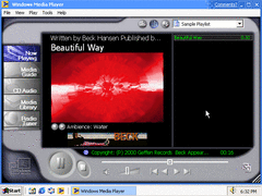
Microsoft now introduces the webby Media Player from Windows ME to their Windows NT line. This isn't really special since Windows Media Player 7 could be installed as far back as Windows 95. Thankfully, the classic media player is still available in the WMP directory.
 (PNG)
(PNG)
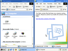
The explorer isn't all that changed, although some folders don't behave like others do. Some look like the new ones in Whistler, while others have the classic look from 2000/ME. Apparently you can do a registry tweak if this bothers you.
 (PNG)
(PNG)
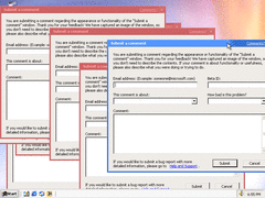
A joke. You can endlessly click the "Comments?" button to endlessly create submit dialog boxes.