Author: Blue Horizon
 (PNG)
(PNG)
There is lots of changes to show in this build so let's get started.
 (PNG)
(PNG)
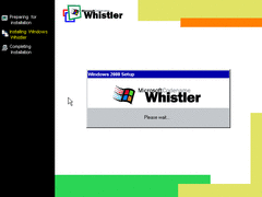
The setup process has been visually changed. It now looks more like Windows ME. Although the setup wizard is still exactly the same as in 2000.
Apparently, choosing the express installation forbids you from typing in a username. So I recommend you choose the custom option during installation.
 (PNG)
(PNG)
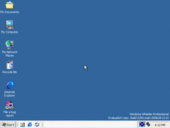
On the desktop, we have a new theme. However, it isn't enabled by deafult. It actually looks better than Windows 10 if you ask me.
 (PNG)
(PNG)
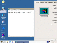
Here's what active and inactive windows look like with this theme. That "System Properties" window is too big for a 640*480 resolution.
 (PNG)
(PNG)
On the system tray, we have a "<<" icon that collapses all icons until you click it.
 (PNG)
(PNG)
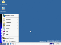
The start menu now has "Codename Whistler" on the side. Nothing interesting here. But...
 (PNG)
(PNG)
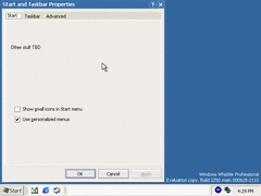
There's an unfinished "Start and Taskbar Properties" window. Also, very professional Microsoft! "Other stuff TBD"? How short and cheap.
However, there's a secret. If you press ALT+D then click Apply...
 (PNG)
(PNG)
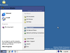
A brand new start menu! On the left, it shows the deafult web browser and e-mail client. Below that shows your recently used programs. On the right, you have your documents and desktop stuff.
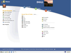
A desktop... As a webpage... This thing is a joke! This is similar to Windows 8's "Metro" screen in some ways.
 (PNG)
(PNG)
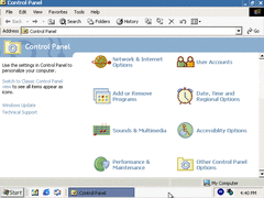
They also redid the control panel and added new icons and more options. Fortunately the classic look is still available.
 (PNG)
(PNG)
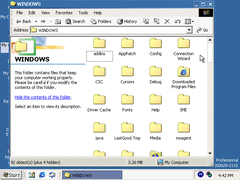
The "WINNT" folder has been renamed to just "WINDOWS". This signals that this new version of Windows will be for both businesses and consumers.
 (PNG)
(PNG)
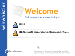
Nothing much new on the logon screen except for the Windows logo, but that second user account is spooky to have.
 (PNG)
(PNG)
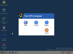
Finally, shutting down. They now made the shutdown prompt webby as well. At least clicking "Turn Off" actually shuts down the computer rather than putting it into standby mode.