Author: Blue Horizon
Despite this being 7 builds newer than the last, it actually has many new features than I thought. Supposedly you need a 1.68 MB floppy disk formatted as DMF for the boot disk, but I found that a huge pain and instead just used winnt.exe /b from DOS.
This is also the last build of the 15xx series, yet we're still in Pre-Beta stage. And it just so happens that this is a server build. Let's take a look at the temporary cool stuff they've added.
 (PNG)
(PNG)
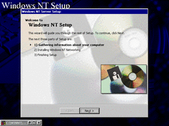
The setup is still the same as the previous two builds, although there is now a CMD window minimized in the corner for some reason.
 (PNG)
(PNG)
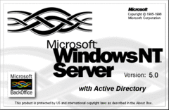
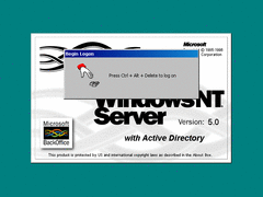
Here's the splash screen wallpaper for this build. It looks like they opened the previous versions splash screen in MS Paint and just typed on it. You can tell cause of the aliased text.
 (PNG)
(PNG)
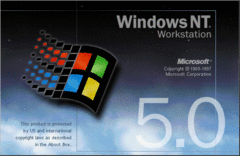
And for comparison sake, here's what the Workstation splash screen looks like for the previous builds. It looks convincing enough to be real.
 (PNG)
(PNG)
Window borders now have gradients on them by default for the first time. Of course the final build used a slightly different color combination.
 (PNG)
(PNG)
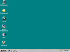
On the desktop they've now added the infamous "My Documents" icon, with combined with the high color icons I've enabled makes Windows NT look more like Windows 98. And it also seems like the quick launch bar is installed properly on first boot.
 (PNG)
(PNG)
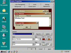
The pre-installed apperance themes now have gradient title bars. Even the high contrast themes have gradients too.
 (PNG)
(PNG)
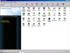
These new toolbar buttons on the explorer are so huge I had to upscale my resolution to 1024 by 768 just to display them all. There isn't even a button to show the rest when the window size is small. Oh, and the buttons are still pink.
 (PNG)
(PNG)
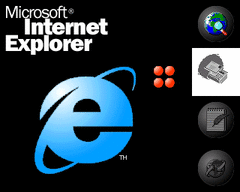
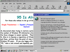
The IE 4 splash screen is updated with shiner looking icons, and adds FrontPage Editor and NetMeeting.
That Outlook Express icon is also looking screwed.
 (PNG)
(PNG)
IE's rendering engine is improved from previous versions, and it now displays whatever fonts certain pages use. And the UI now has those larger toolbar buttons, though I hope that can be changed.
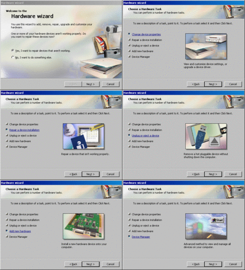
The control panel now has a new hardware wizard with colorful bitmaps. I've compiled all those images into a GIF so you can see it all at once.
 (PNG)
(PNG)
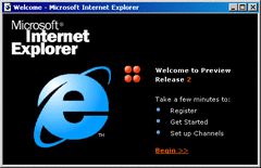
The Welcome window has been replaced with this. Supposedly this is IE 4 Release Preview 2, and you can click the bottom two choices for an introduction on the integrated IE features. Yawn.
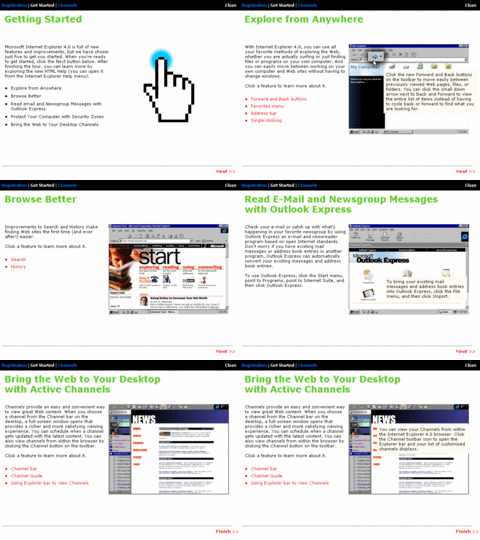
There's a total of a whopping 18 screenshots I took of this introduction which I've also compiled into a GIF. Basically tells you about how having IE "integrated" into the shell is required for Windows to run properly.
 (PNG)
(PNG)
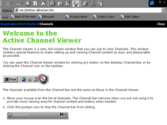
The IE channels now comes with a tutorial. Basically it's IE running in fullscreen.
 (PNG)
(PNG)
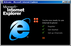
Once you've done all three of these tasks, it has the audacity to tell you you're ready to use Internet Explorer instead of Windows NT or even just the internet
With all that out of the way, that's all the 15xx builds. Now if I'm honest, I don't mind IE, but at the same time all of these features could have been done without it. These early beta IE 4 builds signaled that it would be "unremovable" in all future releases of Windows, just so they could dominate the web browser market and crush Netscape. If only people didn't dabble on about web browsers replacing actual operating systems, none of this probably would have happened.