Author: Blue Horizon
This build actually leaked on December 13th, 2017 on the BetaArchive forums. That's two days after I started reviewing builds of Windows XP. As such, this build is not well documented due to it only being less than a year old after it's leak as of this review.
There are a few changes to document here, however. But most of these changes we're documented in build 1585. In fact, this build is more closely resembled to 1585 than it is to 1515.
Installing this build was also a chore. I had to format the hard disk using MS-DOS 5, then use a Win98 boot disk with SMARTDRV.EXE enabled. After that I run winnt.exe /b from the CD and after the files have copied and rebooted, I had to boot using MS-DOS 6. MS-DOS 5 doesn't work for me as it apparently says on The Collection Book. But I had to edit BOOTSECT.DAT and change "NTLDR" with "$LDR$". I also didn't need to disable ACPI either.
 (PNG)
(PNG)
 (PNG)
(PNG)
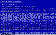
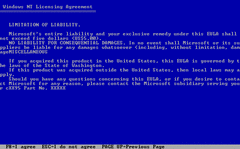
Only a two page ULA for some reason. And even then it forces you to page down until you can accept the agreement. That would never happen today with wizard installers... Oops. I probably shouldn't give them any ideas.
 (PNG)
(PNG)
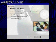
The setup UI is slightly changed. It now has a "multimedia" themed background that's poorly upscaled. In fact that image in the bottom-right corner is basically the background image.
 (PNG)
(PNG)
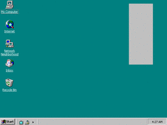
We'll so far, this is already an improvment over the previous build. All that advertising crap is gone (for now at least). Although what is with that gray box? Is it supposed to be the channel bar? I hope not!
I also forgot to mention this last time, but next to the system tray there was a "Show Desktop" button that was similar to that of Windows 7. Now it's in the quick launch.
 (PNG)
(PNG)
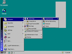
Most of the shortcuts to programs in the start menu are gone. Interestingly Microsoft did this numerous times throughout their development cycle for Windows versions. The most notable one being Longhorn build 4093, when MS was apparently making something known as "Componentization".
 (PNG)
(PNG)
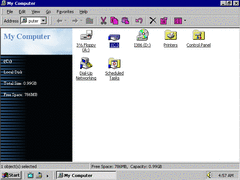
The Explorer is once again given another UI rearrange. Keep in mind a lot of these are taken from the development of Memphis.
 (PNG)
(PNG)
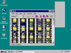
What the hell is this? When I scrolled up and down I wound up with this. Didn't "Windows Gone Wrong" have something like this? Either way it still looks cool, but then again IE 4 is the most evil browser in the world.
I also have no clue why the toolbar icons are pink.
 (PNG)
(PNG)
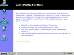
When Windows was shut down incorrectly because of IE 4, you get this screen. I find it funny how they ask the user to "rewrite" this. They know IE 4 is a mess.
 (PNG)
(PNG)
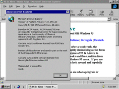
IE 4 is now in the Platform Preview stage. And the background behind the buttons is also gone.
 (PNG)
(PNG)
It's hard to catch, but IE has this new splash screen which features shaded icons of IE and Outlook Express.
 (PNG)
(PNG)
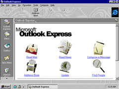
Outlook Express is now included with this build and features swirly background buttons, icons of real life objects, and an oversized IE throbber.
 (PNG)
(PNG)
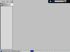
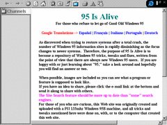
The "channels" button in the quick launch basically runs a full screen IE. Perhaps it's supposed to take you to WebTV or something, but whatever website it's trying to access is probably long gone by now.
 (PNG)
(PNG)
What is old is new again. And people thought IE for Metro was the first full screen browser.