Author: Blue Horizon
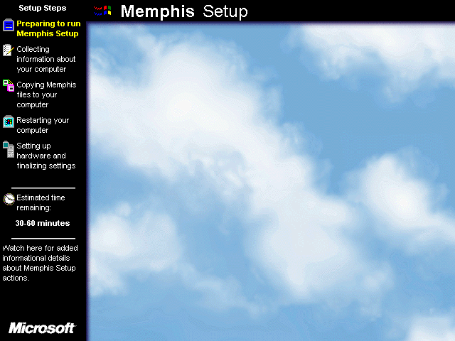
Setup doesn't look any different other than some rearranged icons on the left, though when moving up to a higher color depth: the clouds background is more zoomed in along with a thin purple gradient framing it.
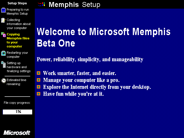
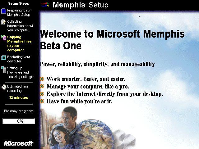
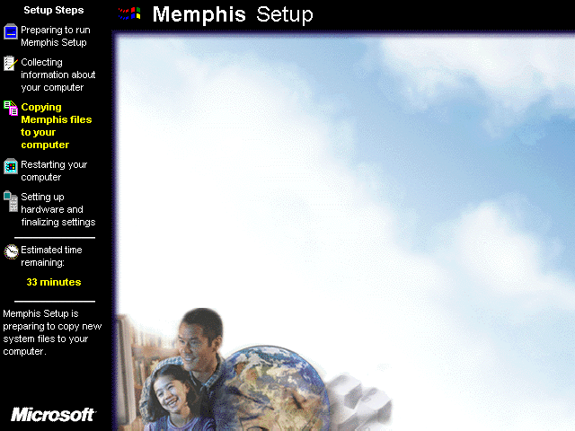
The setup slides have also been redone: now having squares beside the lower text, along with yet another new background with stock artwork on the bottom left (8-bit colors or greater). It's also the only graphic used during the whole file copying process, whereas later builds add more stock graphics in with the other slides.
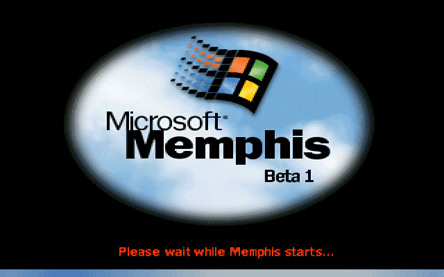

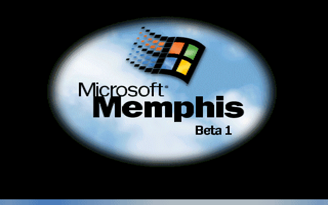
Splash screens have been redesigned slightly: notably the gradient bar animations at the bottom are back, while also looking more "95-esque".


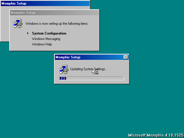
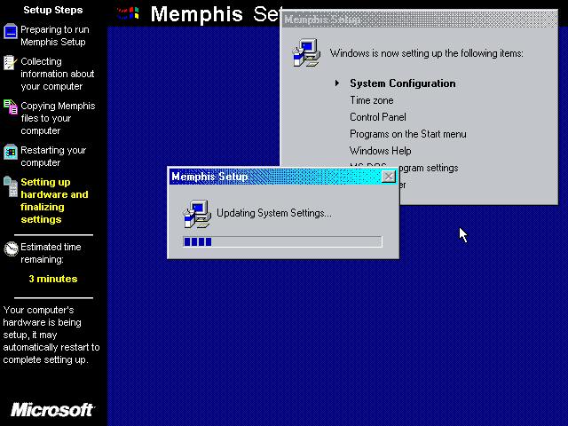
The System Configuration dialogue is now present during the latter part of setup, and behaves mostly how it does in the final release. The only visual difference is that the animated drum icon isn't used yet.
The IE shell is officially permanently welded onto the Windows 9x interface from this point onward, dishearteningly. The new quick launch feature shown in the taskbar along with other enhancements offered in this shell update should've been separate from IE entirely, along with IE itself being an independent program.
The goal of programming any user interface should be to keep doing so until it reaches an optimal and usable state even on lower-end machines that have a small amount of RAM (roughly 16-32MB), not throw arbitrary changes into the mix to look relevant as such that only ends up using a large footprint of system resources.
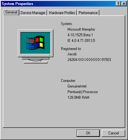
System properties displays a "Beta 1" tag in the general tab.
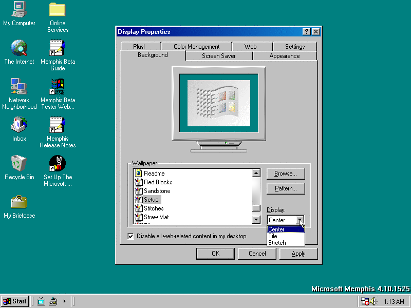
In display properties: the background tab is redesigned to accommodate the IE interface, now having an option to display an HTML page as the background. You can also now use JPEG images for backgrounds, though the functionality of that is very buggy here unsurprisingly.

Along with the web tab getting a facelift, you can now input URLs for adding 'items' on the desktop. Considering the constant upkeep of changing domain names and supposedly needing to catch up with web standards - added with the fact that having to update the browser also means dealing with updating the entire shell of the system, its novelty is very trivial in terms of longevity.

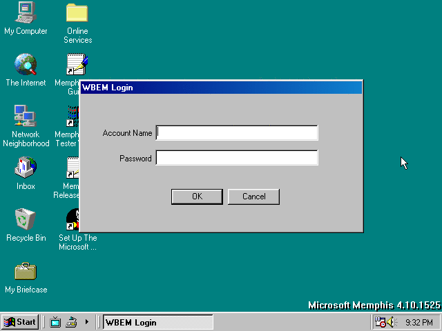
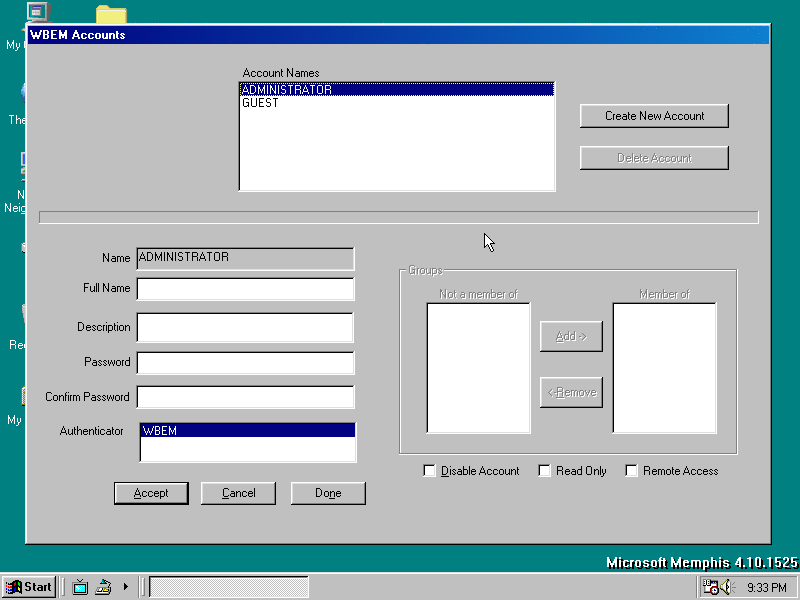
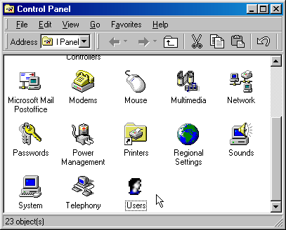
There's a new Users icon shown in the control panel. The explorer is also indeed consumed by IE, at least not too intrusive in this state - though that isn't saying much.

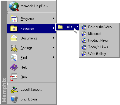
There's now a 'favorites' menu added in start, basically advertising a number of Microsoft's domains among other sites later to be added.
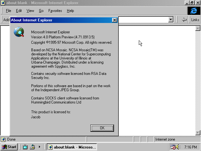
And here's IE itself. The oddball thing here is that they arranged the toolbars in places that don't entirely make sense especially when used with smaller screen resolutions, though they can be rearranged at will.
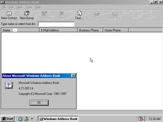
Nothing new about the address book other than the groups list on the left isn't enabled by default.
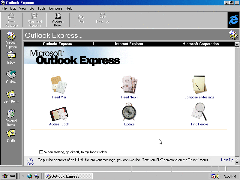
Outlook Express has another redesign that consists of an updated home page with changed/rearranged graphics, plus some tweaks to the upper toolbar.
The TV Viewer setup has also changed quite a bit; consisting of one page with a clickable download link and colorful graphics.
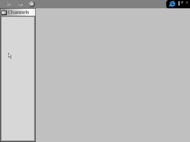
Clicking the Channels button from the quick launch toolbar opens IE in full-screen, completely void of content. I can only guess this would be used alongside TV Viewer.

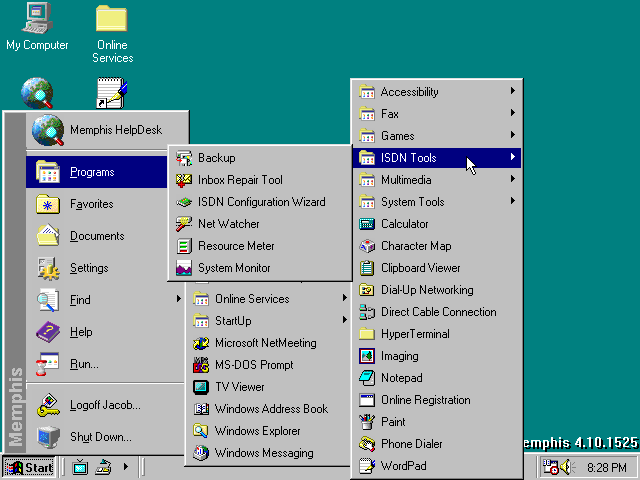
Some items from 'System Tools' have been moved over into a new sub-menu named 'ISDN Tools'. Should be self-explanatory.
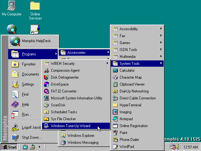
As for the 'System Tools' menu: the tune-up wizard I've demonstrated in the previous build is present here, plus another sub-menu is added.
Within that sub-menu is 'WBEM PDK Security Editor'. The program interface itself is also unusually large, requiring the use of 800x600 resolution or higher just to display all of it at once.
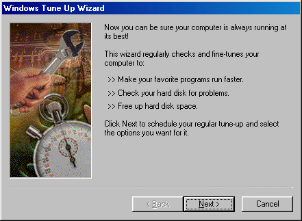
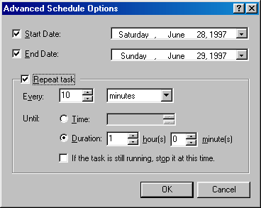
In the tune up wizard; a 'run now' button has been added in the second step that does what it says with any of the highlighted choices above. The 'settings' button only works for ScanDisk, and it looks like the disk defragmenter wizard finally gets used here.
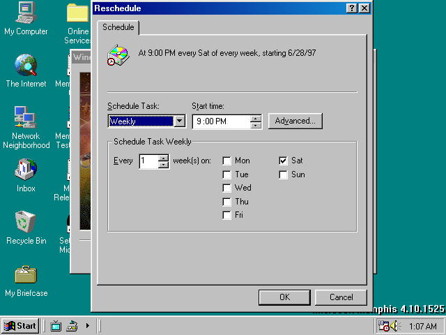

You can also reschedule and set how long each program runs before automatically stopping it.

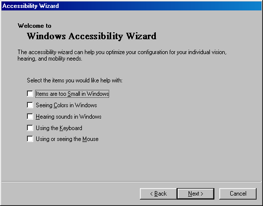
The accessibility wizard is updated again. I won't go through the steps since it's the same wizard that I already covered in my NT 5.0 breakdown.

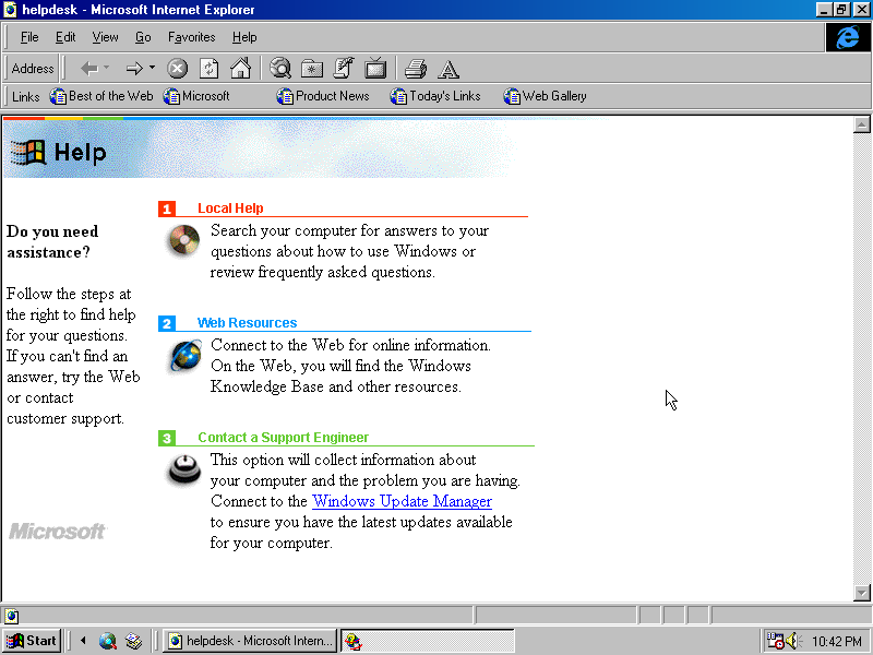
HelpDesk has a new banner graphic at the top that bears a lot of resemblance to the 98-style; having the four colored stripe and cloudy sky. Apart from the redesigned page, there's a third option for contacting a local support engineer so long as they are connected to the internet.
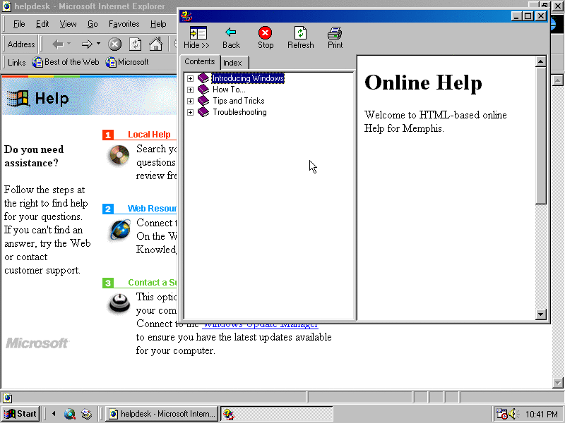
HyperHelp is now available by clicking the first option on the page, though it has yet to "replace" the help system from 95 in the start menu as opening Help there still opens the older one.

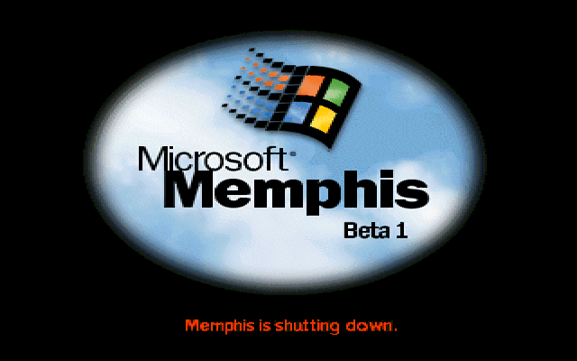
The shutdown splash screen. As a whole: it's disappointing to see the direction Microsoft has taken with developing the interface further; as it could've been a near-perfect successor to Windows 95 simply by adding broader support for more hardware and native SSE instruction set support (should you need it), among other benefits while not throwing a heavy amount of burden onto users by adding webby elements they don't want or need.
IE at this point is certainly not as bad as how it would manifest later on, though it certainly is starting to get to that point.
Like always, here are the included release notes in this build: