Author: Blue Horizon
BUILD 1434
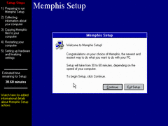
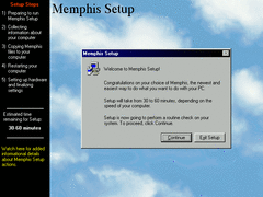
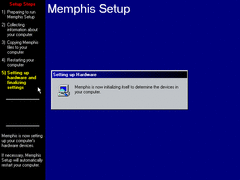
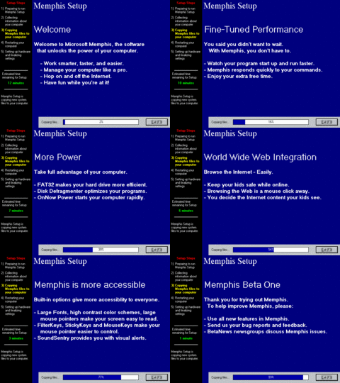
To start things off in setup, the noticeable change is that the sidebar is now black rather than grey with the addition of colored text; such as red for 'Setup Steps', yellow for the bottom descriptions, and green for time remaining (see screenshots below). The background pattern is also changed for 16-color mode.
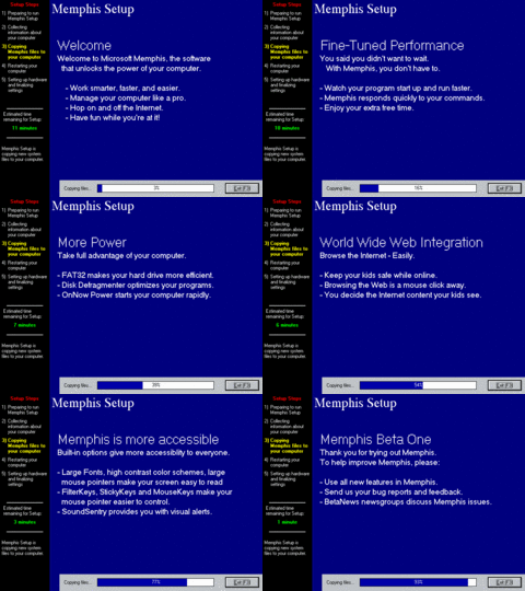
Here's most of the descriptions during setup. Note the green text for the estimated time counter mentioned above.
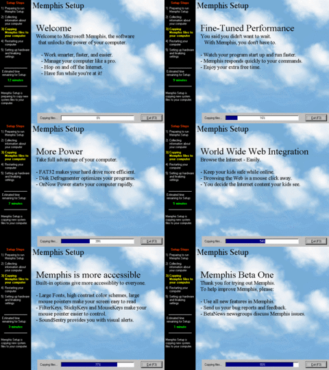
The file copying procedure is noticeably more different in appearance; rather than having a slideshow of cue cards to stare at while the progress bar drags along, it has been replaced with animations of plain white text (or black text if ran under a higher color depth) that scrolls to the left into place when it appears. It also pauses the file copying process for a brief moment whence playing these animations.
But of course, here's all the actual slides themselves. Overall starting to resemble more like the final setup process in its design, and its flawed advertising.
The time remaining counter is (still) completely blanked out during later stages of setup.
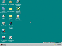
An icon pertaining to a newly added program called "HelpDesk" is added to the desktop.
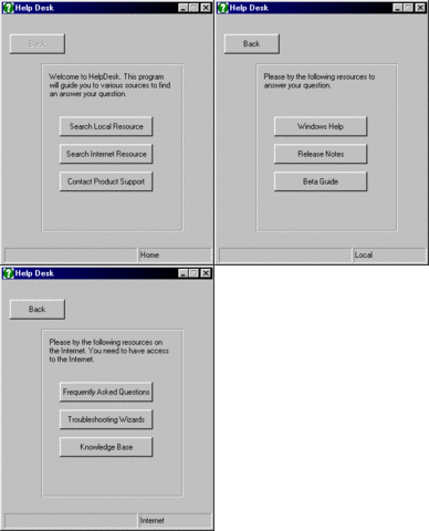
The program itself isn't all too special; just buttons/shortcuts that open local resources and site links pertaining to beta information.
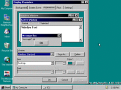
In appearance properties the gradient color buttons are now referred to as "Color 1" and "Color 2", as goes for the final build.
This is also in build 1423, though I didn't search around long enough to notice it: the Prodigy wizard is updated once again with a webby full screen interface, though at least it has visible buttons to click on for exiting and such.
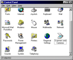
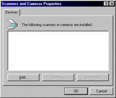
Scanners and Cameras in the control panel is given a new icon.
As always here are the release notes for this build:
BUILD 1488
Because of the drastic jump in build number; it's worth pointing out that this build was compiled just two days after 1434, highly suggesting that Microsoft leaped build numbers somewhere in-between those two points. As such, only a handful of things have been changed
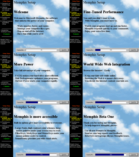
The file copying portion of setup remains mostly the same (little pieces of dialog reworked to fit the screen) - just with bolder text now.
At last, the 'first time' and bootup splash screens are changed (as well as the shutdown screen). Only noticeable differences here when comparing the one from builds 1400 and 1410 is the oval is less stretched out and moved towards the top of the screen, along with a different cloud background.
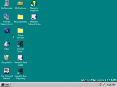
Usual stuff on the desktop: Some rearranged icons, including the IE icon which doesn't have a nametag oddly enough.
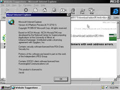
A slightly newer version of IE 4 is brought back, although this time without the active desktop update.
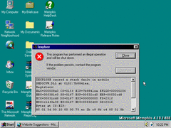
IE now crashes when being closed; possibly due to a side effect of the active desktop interface not being present or something. Practically useless information since you will likely almost never touch or use IE.
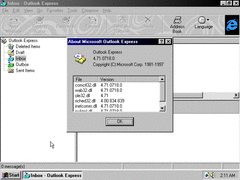
Slightly newer version of Outlook Express.
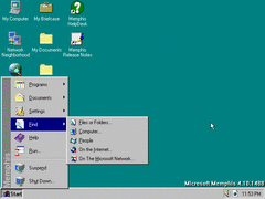
All the find options associated with the IE 4 components return here.
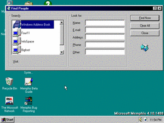
Interface wise; the 'Find People' window now has larger icons and some text boxes rearranged. Nothing too exciting.
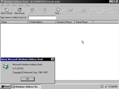
Address Book itself is also moderately updated.
Shutting down. All in all some nice little touches and enhancements to the Win9x kernel, though all these improvements will soon be outweighed by drastic compromise on performance not too far ahead in development just for the sake of web-integration - so enjoy it while you can.
