Author: Kugee
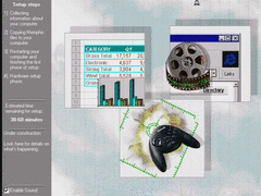
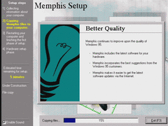
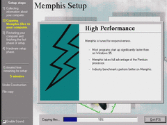
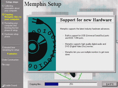
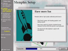
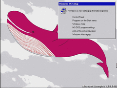
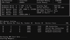
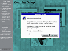
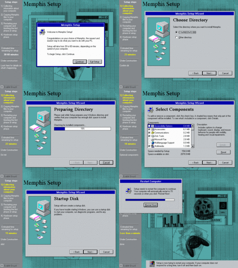
Upgrading to build 1400 from 1351, not a clean install. The setup background is now available in Technicolor.
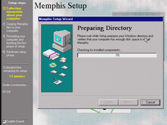
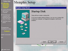
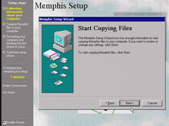
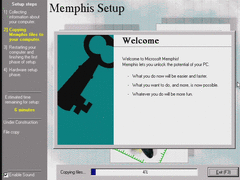
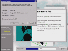
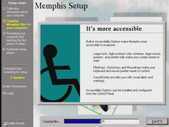
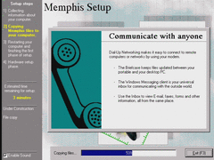
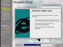
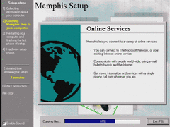
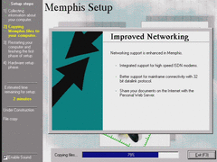
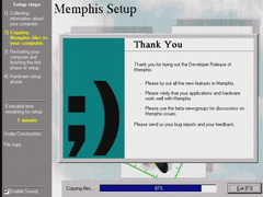
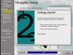
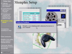
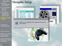
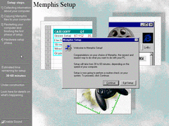
The sidebar has some things added to it, like "estimated time remaining for Setup" and a description of each part of Setup. Such descriptions are obviously placeholders, like "EULA" and "Dir Init".
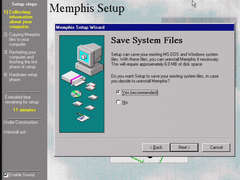
Saving system files caused some problems for me, can't remember what they were. It's better not to save them.
Notorious typo correctwd.
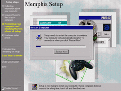
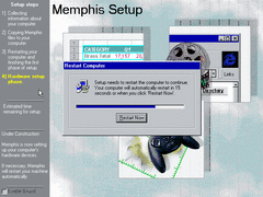
Setup now has a 15 second timer before automatically rebooting.
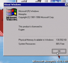
Memphis now calls itself by its respective codename here. The default Windows 95 splash still exists in IO.SYS.
For a split second, the setup background unloads to reveal the user's wallpaper in 16 colors... and probably makes you question what ever became of this guy.
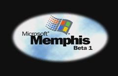
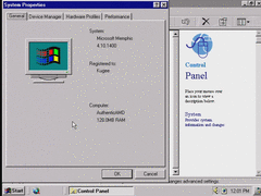
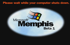
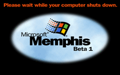
New splash screen, Memphis is now in Beta 1.
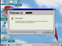
All drivers remain intact, and the welcome screen now shows different tips of the day. No side buttons in this window still, clearly they were going to do away with it in favor of a "Welcome to IE4" screen which was eventually replaced with a "Welcome to Windows 98" screen.
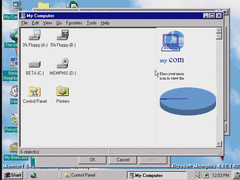
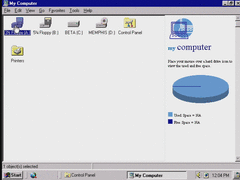
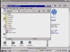
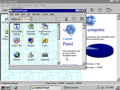
This build implements a new Explorer window layout that depends on Internet Explorer, basically an early attempt to integrate the web browser with the core user interface. Needless to say, it's clunky and gross.
It's especially uncooperative with window scaling...
...unless I maximize a window, or maybe I could've turned off "Show window contents while dragging" for better results.
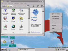
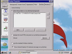
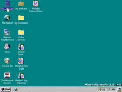
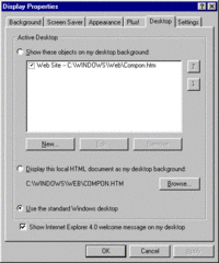
Already, the option to display web components on the desktop or use an HTML background is available. No components actually show up here, though.
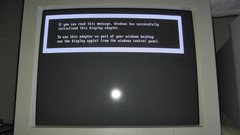
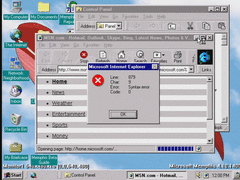
If Windows recognizes a second monitor which is not yet enabled, this message appears, which is different from the final release:
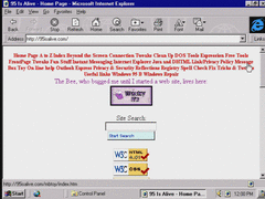
I need to make a website that will work with these old browsers at some point...
HTML 4.01 compliant! The website, that is...
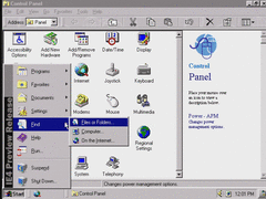
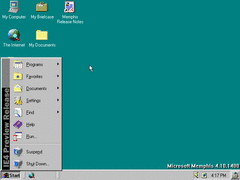
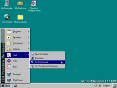
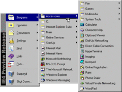
The Windows 95 banner on the Start menu is replaced with "IE4 Preview Release". Imagine if Windows was renamed to "Internet Explorer 4".
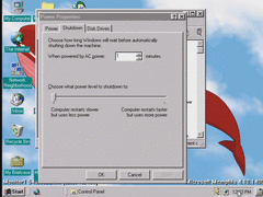
Memphis 1400 has an auto shutdown feature. Not even suspend or standby, just a full out shutdown! I've tried it, it doesn't work on this build or computer.
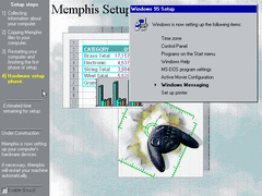
Windows Messaging works after upgrading from build 1351 to 1400.
DOS games play as expected.
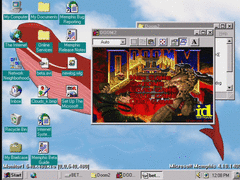
Playing Doom II on the primary monitor while letting a very boring political report run on the secondary monitor. Many DOS applications will eat up a lot of the CPU's time, which slows down most other programs.
That's all I have for this build. I can't guarantee I'll regularly add the five other builds I've used here, as I have a lot of work ahead of me for an upcoming project. If there's any other screenshots you want to add here, please do so.
Author: Blue Horizon
We now depart from the pre-beta trilogy right into Beta 1 territory. This is the period/phase where Microsoft started to weld Internet Explorer into the actual shell of Windows to tie the web with the file browser. That, of course, bogged down performance especially on much lower-end hardware of the time (e.g. a 486 or an early Pentium) since IE was always forced to be launched when logging in, and took up a considerable chunk of RAM and disk space.
I'd say at this point, IE integration is much more tame compared to later builds in terms of overall resource usage, though it's pretty noticeable that the browser is starting to become Mr. Hyde.
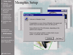
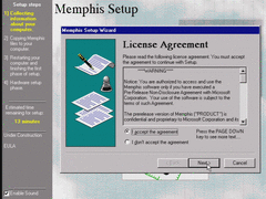
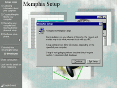
In setup, the only noticeable changes thus far is the sidebar is a darker shade of grey with white text, as well as a 30-60 minute ETA, a description field providing information about the steps, and a sound toggle.
It's also a bit hard to notice, but the background image is set to be scaled based on what resolution setup is running at using the nearest neighbor algorithm - which I'll demonstrate in a bit here.
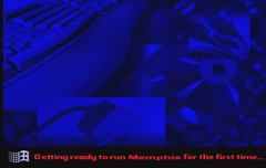
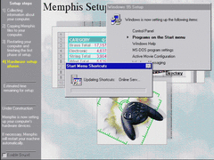
Here's some screenshots of setup along with their placeholder descriptions on the left.
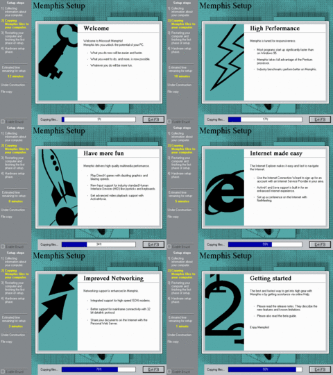
The setup slides are exactly the same as in build 1387.
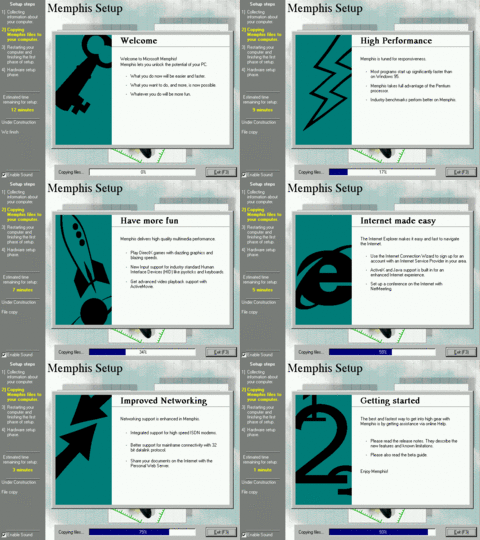
And here's the obligatory same slideshow now in high color mode.
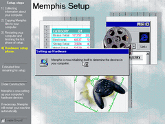
After a restart, you can see that the 2nd phase of setup now has the sidebar and background, although the ETA is absent during this part. The Memphis Setup text at the top is also a different font for whatever reason, and more of the system is now being renamed to Memphis as shown in the window.
For comparison, when upgrading from a previous build (or re-installing from the same build), the font at the top remains the same.
This build now requires you to restart three times during installation rather than two. I have a suspicious feeling this has something to do with configuring and installing IE during the latter part of setup.
During the 3rd phase of setup, Active Movie Configuration is now present in the item list.
I'm still not done with talking about setup just yet, as there's some other things I mentioned earlier that I'll cover here now. A sound effect can be heard whenever you start the setup wizard (assuming you have sound enabled) - which is actually just the NT 4.0 boot up chime:
There's also additional sounds when you progress or backtrack through the wizard, and you can toggle them off if you prefer. It's unnecessary, but it's cool.
Moving up to a higher resolution, you can see just how choppy and blown up the background is using the nearest neighbor algorithm.
The boot screen has been changed for Beta 1 - now having an outer black background rather than white, much brighter sky clouds in the background, and some repositioning with the logo and text.
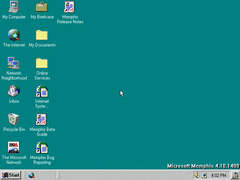
On the desktop, there's already some noticeable differences from before:
- ·A "My Documents" folder has been added, though not in the same way like the final build
- ·The two internet links/shortcuts for Memphis from the start menu have also been added
- ·Four icons on the left have been repositioned from the last build
- ·A quick launch bar is now present in the taskbar
- ·Next to the system tray, a "show desktop" button (the tooltip refers to it as "Surface/Restore Desktop") has been added - functioning similarly to the one in Windows 7
- ·Dr. Watson is removed from the startup folder, but the utility is still included nonetheless
Hovering over an icon for half a second highlights/selects it automatically.
In the start menu, the banner has been changed to "IE4 Preview Release" along with the addition of a "Favorites" folder.
Also in the find menu, there's an option to find stuff online, though it requires the internet to function.
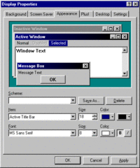
Instead of a toggle for enabling gradients, a button for selecting the 2nd gradient color takes its place. Although, you still have to select one of the title bar attributes to see it. And to disable gradients, you have to set the second color to be the same as the first one. It's a bit cumbersome to figure out.
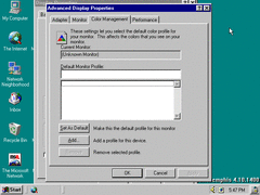
Color management has been moved over to the advanced display properties, and the dialog is fixed.
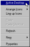
In display properties (as well as right clicking the desktop), you have the option of toggling the active desktop - another component of IE. More unnecessary clutter for your desktop.
I should also point out that the properties window is too tall to fit on a 640x480 resolution with the taskbar enabled, unless you first hide the taskbar or move it to the sides.
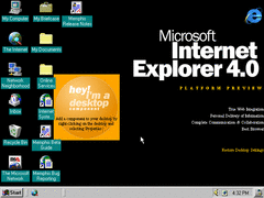
And here's the default active desktop. It looks similar to the one in the first NT 5.0 build I reviewed (#nt5-1515) with only some minor differences.
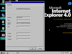
Bringing up properties for a web asset on both the desktop and browser produces this overly large window. Obviously they haven't """perfected""" integrating the webby environment with the user interface yet.
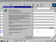
And for completion, here's a screenshot of IE with the new version number.
Also, now that IE is integrated with the interface, it will be even more of a pain to update it since not only do you have to keep it compliant with evolving web standards, you also have to deal with updating the shell of the OS too by not breaking it. It should've been a selectable optional component to begin with if it weren't for people at the time spreading the idea that browsers will eventually make the desktop interface obsolete (and it looks like their mindset hasn't changed since).
Plus, if anything happens to go wrong with IE that doesn't seem to be easily repairable, that would mean re-installing the whole system from scratch. What a mess.
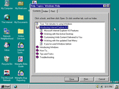
Help now includes topics regarding the new IE interface. Thankfully it isn't replaced with HyperHelp yet.
Of course, the file explorer itself now relies on IE to browse directories. Now you can scavenger through your folders surrounded by info-oriented eye candy.
One nice thing I can say about the new explorer is that you can minimize windows by clicking their respective taskbar buttons; something I thought Windows 95 could've used, even if it was minor.
If you're interested, here's a ZIP archive containing just about all the graphics for the IE stuff in this build - including explorer and desktop assets.
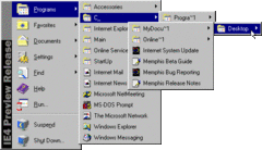
Further investigating the start menu, it seems that there's an extra programs folder comprised of shortcuts and directories that are duplicates of other existing items. I'm guessing this has to do with setup adding start menu folders and shortcuts twice during the last part of setup - obviously not how it was intended.
A minor observation; it seems you are now able to drag items within the start menu and arrange them however you like, although the functionality doesn't seem to be fully implemented yet as you're unable to actually move items around.
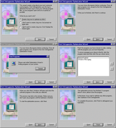
Now to show off some utilities both new and updated: starting with applog. It hasn't changed too much since the last build. All that's new is there's more options to select from at the beginning, and both IE and Messaging are present in the list by default.
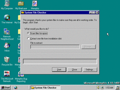
System File Checker is now included in this build, and it's slightly different from the final one - but it is more or less the same. Yet another utility to work around design flaws in Windows.
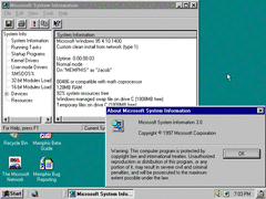
MS System Information is also now included, providing information on various things like system components & resources and the build itself.
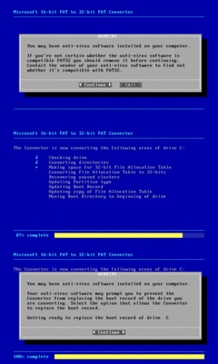
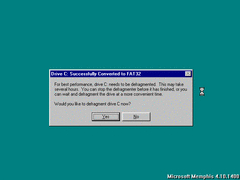
The FAT32 converter now functions in this build. It's highly advised you defrag the hard disk after conversion for optimal results.
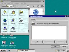
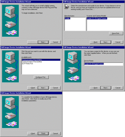
There's a new control panel applet called Still Image which basically keeps track of the digital cameras and scanners that are installed.
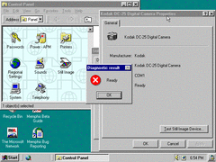
Currently the only device or manufacturer listed in the wizard is a digital camera from Kodak: the DC-25.
Obviously I don't actually own or have one installed, but I did find this diagnostic result to be amusing.
Shutting down. The shutdown screen is similar to the boot screen other than a duller cloud background, and the Windows logo being reoriented.
I did manage to catch a glimpse of the shutdown screen when it spontaneously glitched out, so I'll leave this screenshot here.
I can't guarantee I'll regularly make more upcoming reviews on Memphis thanks in part to some new hobbies I picked up recently, though I surely won't stop production on the museum anytime soon.
