Author: Blue Horizon
Completed: December 31, 2023
The slides during setup retain most of the same structure as before with only minimal differences, such as the squares now being solid black, and some dialog being reworked to be more fluent with its message.
This particular build excludes Microsoft FrontPad from the setup routine list near the end.
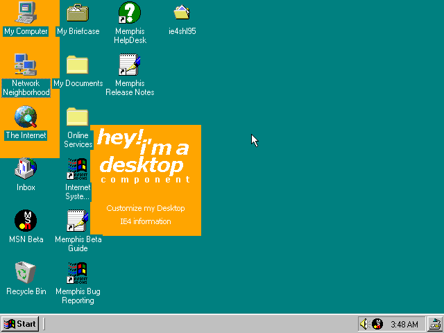
Before getting into the actual build, there is one thing about build 1500 that is hidden away; within Win9x20.cab (and 21) is a CAB file titled Ie4shl95. It includes files made to restore the Active Desktop shell, as there's no visible way to do it from within the interface itself. As expected, it functions how it would when plastering HTML elements in the background, though one bug I've later encountered is that the icons disappear when the Active Desktop is enabled, and only come back when disabling it.

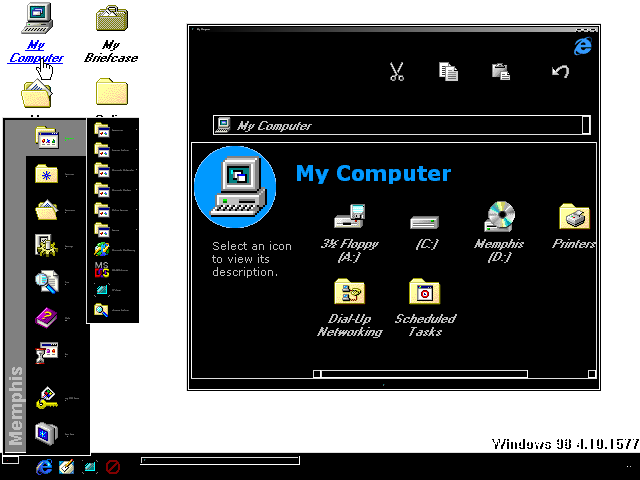
The Explorer overall retains the same layout since build 1400, but has a different sidebar with a really dimly lit variant of the Clouds background. Selecting storage related icons doesn't bring up a pie chart like before, it simply tells you the amount of space left.

With the external shell present, the Start menu becomes its oddball taller variant with a different banner. Some garbage data also gets left behind.
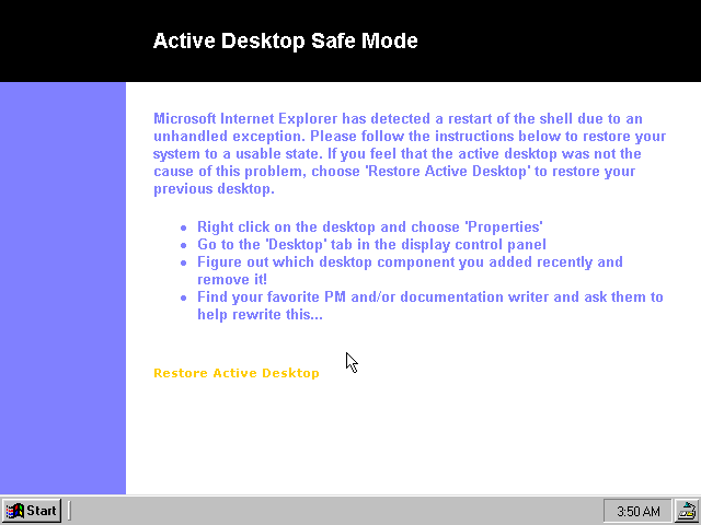
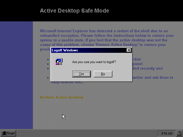
I often forget that back then, Desktop Recovery was called "Safe Mode". This likely was changed to avoid confusion with the actual safe mode option in Windows, so as to avoid mix-ups such as during tech support calls with users thinking and/or claiming their machines are running in safe mode when it's brought up.

The logoff dialog is changed to be wider and have a unique icon on the side.
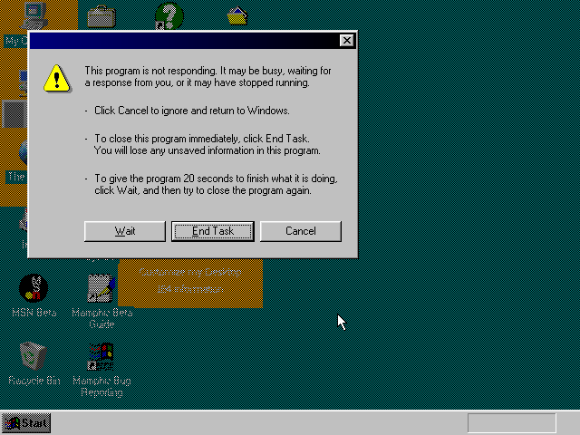
Since the shell was more in an experimental stage during this time, the glitches that occur are highly apparent. Love how parts of the GUI are covered up since the inactive parts don't get redrawn.

This same CAB file is also stored in later builds like 1511-1518, but is almost unusable, hence why I ended up using 1500 for demonstration purposes.
Now, back to the main event!
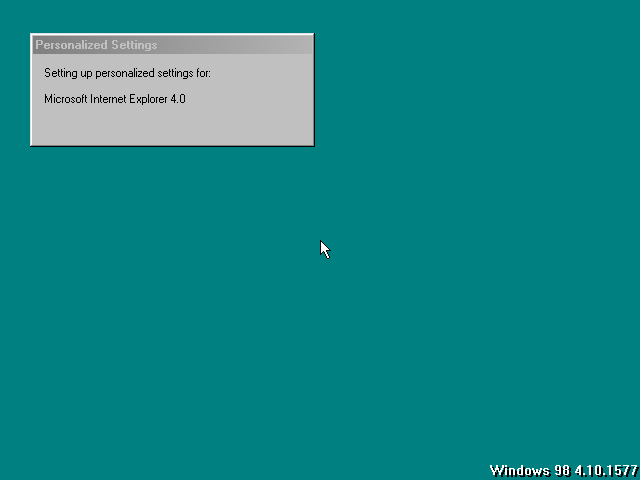
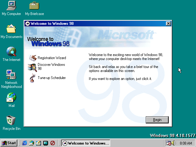
Upon first boot to the desktop, the dialog for configuring "personalized settings" has been added in, which mostly attributes to Internet Explorer. This dialog would also subsequently be used for every version of Windows since then (albeit more obfuscated), including Windows 10 and perhaps 11.

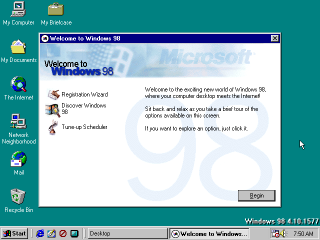
"Welcome to Windows" has a new icon to line up with the "circular" aesthetic that IE4 was really pushing towards. Other than that, it's pretty much the same. I did happen to notice on first boot that a service called "Desktop" was running, likely behind the scenes stuff you're not meant to give much thought.
Also, I'm just noticing this... but, the Tune-up Scheduler's icon is a toilet plunger. What a perfect analogy...

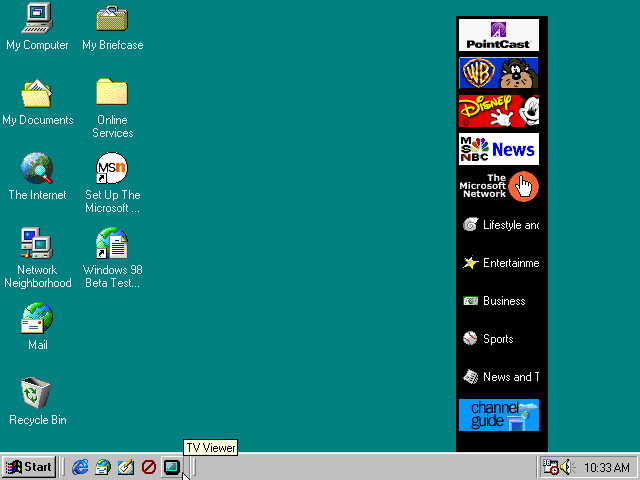
The main differences with the default desktop are the icons, with the "View Channels" button strangely being replaced with a "don't" symbol, despite the finalized icon being in the previous build. Though, it still functions as normal. The icons for Mail and HTML file associations now use an updated color palette for their designs, with the envelope in the former now just being stationary instead of flying. Internet Explorer oddly still uses its globe icon rooted from the Plus! pack, even though the quick launch icon has taken its desired form.

And if you're wondering, the Channel Bar is still the same as before.
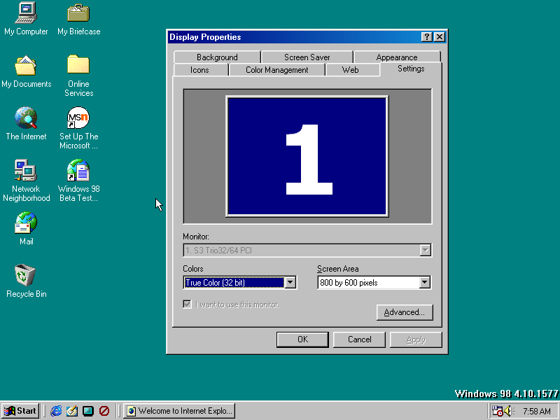
In the Settings tab for the display properties, the interface has changed to that of when a machine typically has more than one monitor present, yet it currently replaces the traditional resolution monitor preview interface. Regardless, it still behaves the same as before.
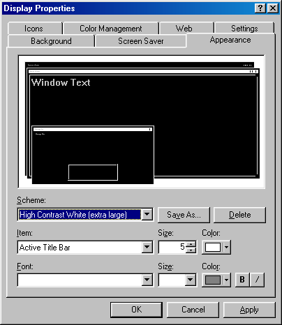
This build has a really nasty bug where selecting a theme from the appearance tab will output a corrupted result featuring small title bars, black and white colors, and miniscule text. Applying any theme from the list will subsequently set it to that corrupted one that's previewed. So, whatever you do, do NOT set themes on this thing unless you want to make Windows half-unusable.

...like what I just did here. Apparently, selecting multiple high contrast themes in the properties window causes it to combine them all into a giant mishmash of nonsense. You're better off using the Desktop Themes applet from Plus! if you really want to tinker with the colors, fonts, and window sizes.
Also, selecting a second gradient color from the properties window is gone for whatever reason. Probably a case of working from an earlier iteration of DESK.CPL?
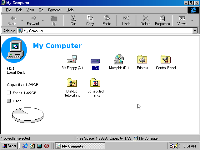
Besides the pie chart being reverted to its usual white and grey scheme, the current directory is now displayed in the bottom right corner, and the address bar is moved below the first toolbar to conserve horizontal space. This is also how the layout would ultimately be shipped as in the standalone release of IE4 alongside its inclusion in 95 OSR 2.5.
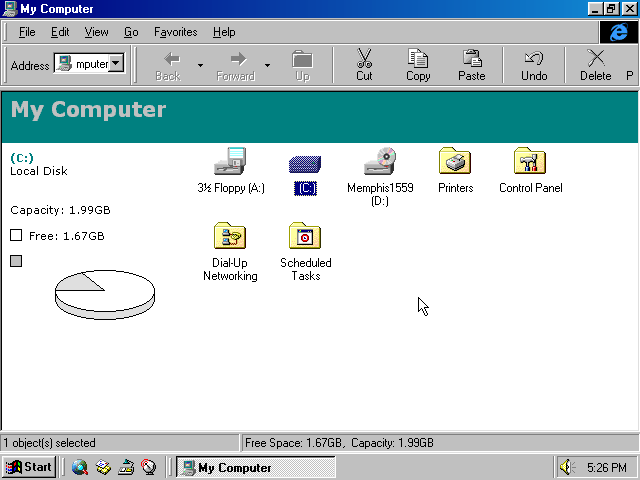
For comparison sake, this is how it looked like back in build 1559 with its short-lived teal bar theme.
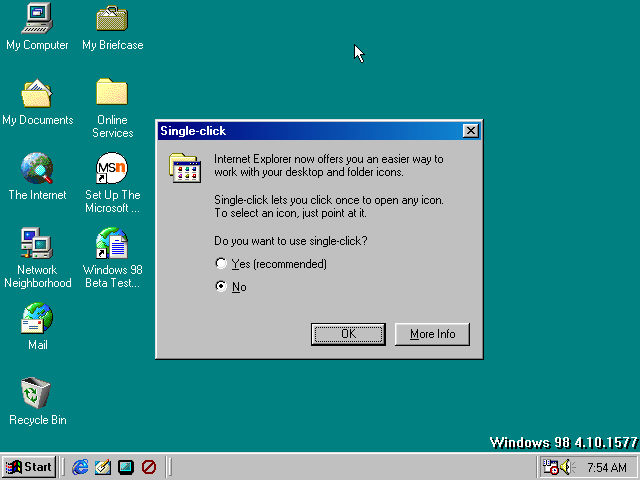
Oh, almost forgot to mention; the first time starting Explorer, it brings up this message asking to choose between clicking icons once or twice, with single-click being the recommended option. Easy to see how this would've made the shell even more annoying to use had this been kept in all the way to retail.
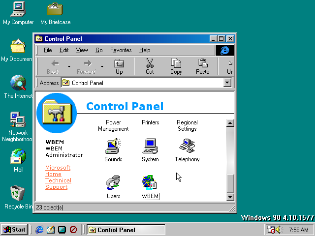

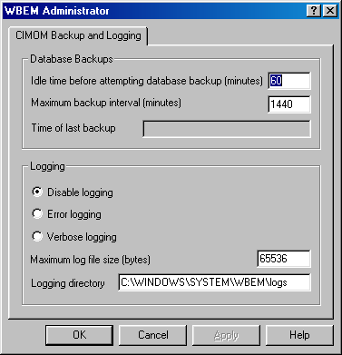
I don't know anything about the CIMOM standard, but it appeared to be developed by IBM with the purpose of managing and backing up databases periodically. It just happened to be one of the applets included in the control panel.
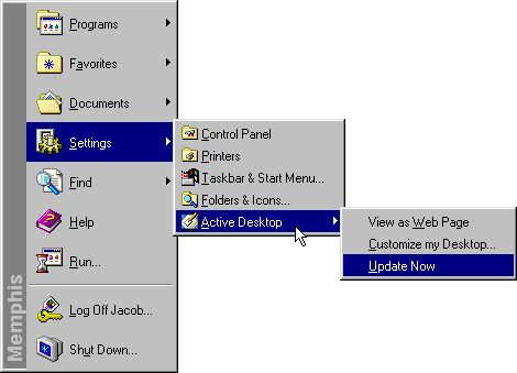
In the Settings menu, Active Desktop is no longer separated by a line like in the previous build, although the "Hide / Show" option has been renamed to "View as Web Page".

The online registration wizard is also purged from the menu, but can still be found by running regwiz /i software\microsoft\windows\currentversion.
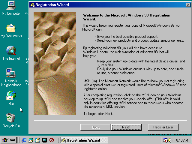
Here's what that wizard looks like now: the graphic on the left is completely revamped - calling back to the style of the setup background that was made famous in NT 3.51, 95, and NT 4.0. The text at the top has been made bold to emphasize how serious it is that you register over the internet with Microsoft. MSN is heavily mentioned in the second half to further try and entice the user to sign up for those exclusive online surfing perks ! !
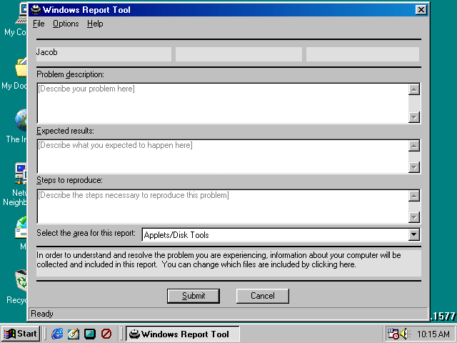
"Microsoft Bug Reporting Tool" has been renamed to "Windows Report Tool", with Bugrep32 being renamed as Winrep alongside it. The application form for bug reporting is much more detailed and elaborate, with it now having forms to write expected results and the steps to reproduce the problem. The name is also now split up into three separate groups, presumably for the middle initial and last name alongside the first. Inputting an email address, beta ID, and password is now catalogged for submitting a report too, while the information regarding the computer's configuration and version is collected automatically during processing, rather than asking the user which files to upload.
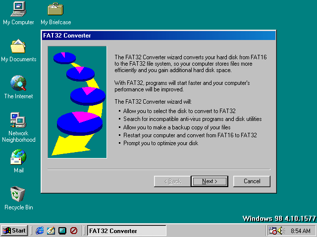
The FAT32 Converter receives another upgrade by replacing the banner on the left, which previously had drive circles that look like they came from Wheel of Fortune - still looking like it wouldn't be out of place in 95. Much of the dialogue has been changed up in some spots, there's less steps to go through during the first portion of the wizard, and the Help button has been axed.
Also, clicking "Create Backup" in the FAT32 wizard takes you to Microsoft Backup in case something goes wrong.
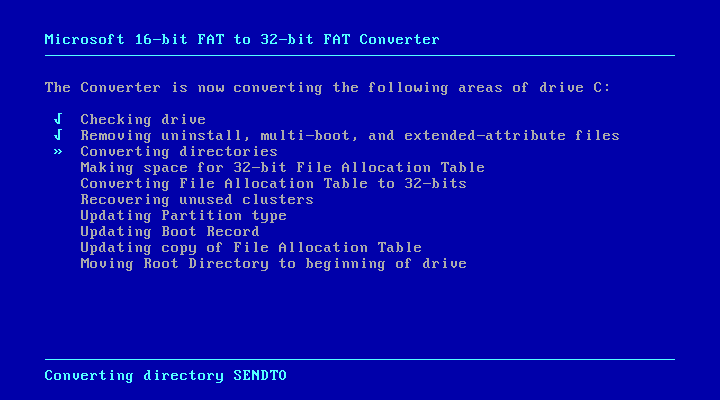
The MS-DOS portion still remains the same as before.
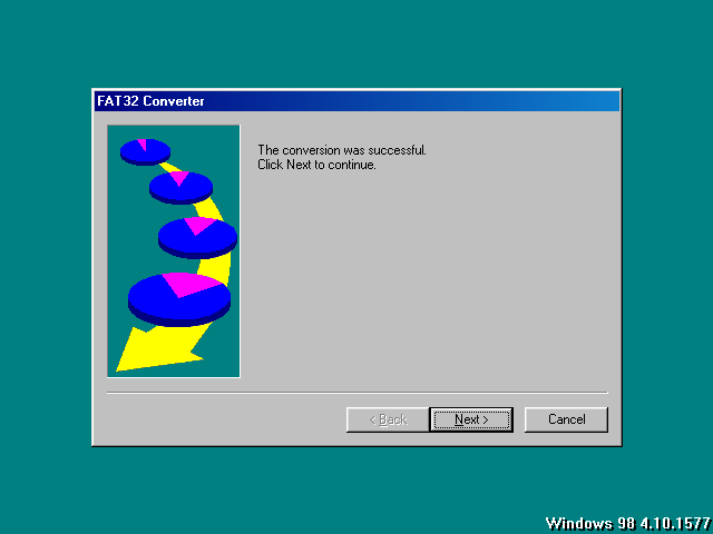
Obviously, it's a good idea to defragment after converting a drive to the new filesystem.

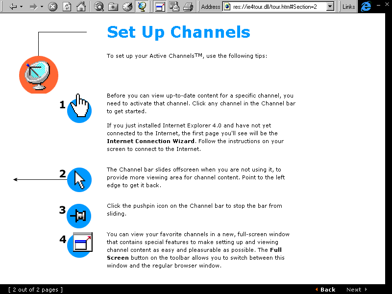
Active Channels interestingly contain new screenshots that depict the finalized style on the Channel Bar buttons seen in almost every 9x build since. However, since this build is sourced from scene releases, space was compromised and thus those buttons don't fully appear proper.
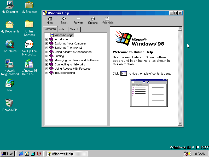
HyperHelp has been reworked as well, featuring a new welcome page, updated contents section, and new icons for the upper buttons.

It wouldn't be complete if you couldn't squash it down to the point where even the buttons adapt to the new size, but the subsequent interactive tabs and reading area doesn't.

"FrontPad" has been rebranded to its finalized name; FrontPage Express. The interface is still visually the same.

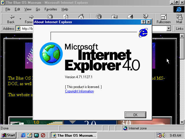
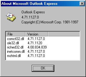
In Internet Explorer 4.0, the about dialog was tweaked to more resemble like the finalized one. However...

The infamous credits Easter egg has now been implemented. The way to access it is almost identical to how it's normally done: by holding Ctrl while dragging the IE logo around. Except here, there's no hidden "Unlock" button to reveal and start an earthquake - it's as simple as doing the aforementioned straight to the globe.
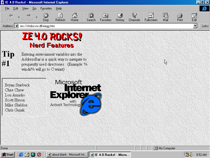
The egg is completely different here, seemingly more of a dumping ground for exchanging tips with the user as each one appears automatically. So it isn't really a credits Easter egg (aside from that box in the corner) as it is more of a glorified "tip of the day" section.
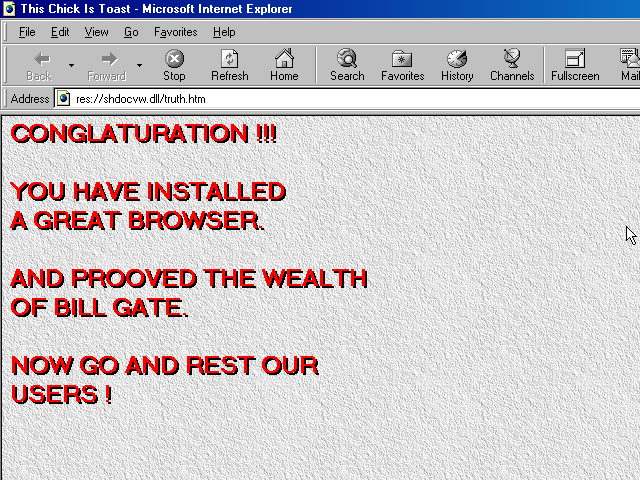
Also, points off for the statement at the top. Even if it did rock, it doesn't need to announce it directly. This is how it would look like if they truly were being honest with their minds and heart:

That strange Windows 95 banner was short-lived, as another one has come to take its place. Even though this would eventually be replaced by one that is branded after the operating system, it would be reused for later 9x builds.

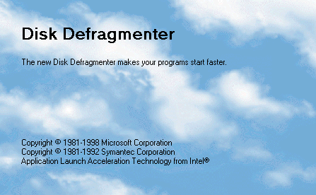
Disk Defragmenter gets its very own splash screen that consists of Clouds.bmp with MS Sans Serif text plastered over it. Developer's creativity aside, this is obviously a placeholder, and it turned out that any type of splash would be ditched entirely by release - instead opting to have Intel's name shown when selecting a drive in the end. So unusual to go the extra mile of creating a companion piece to the program only to then have it be canned moments later.

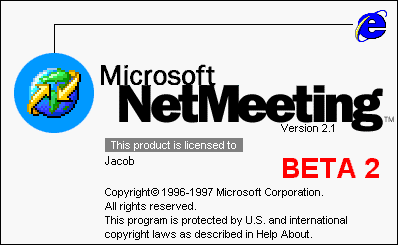
NetMeeting's splash screen is finalized apart from its "BETA 2" branding.


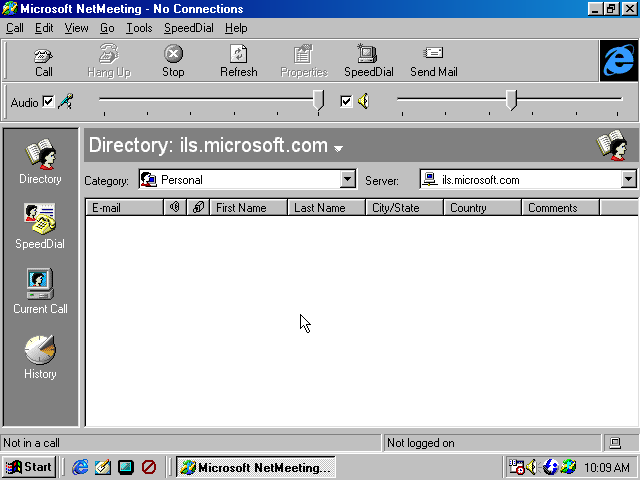
The overall interface remains the same as before, just with minor changes such as the volume slider being in the center by default, and the history icon being replaced with a sundial. NetMeeting's icon itself has also been visually enhanced with a better color palette. This is ultimately how it would end up in the released product.
Outlook Express also has a new splash screen that doesn't derive from the Office 97 style. Like previous builds, the icon is an envelope in-front of a newspaper, with the former later being reused for a revised icon.
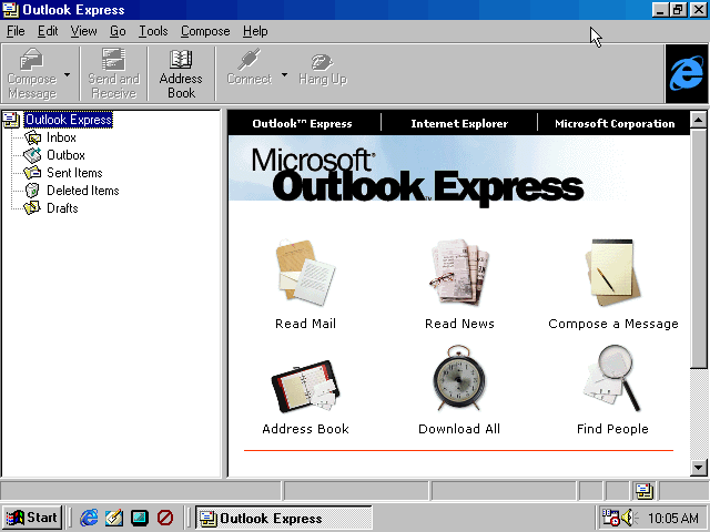

A status bar has been added at the bottom with "Update" being changed to "Download All". That pretty much covers the IE suite programs for this build.
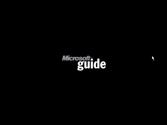
TV Viewer shows a "Microsoft Guide" splash upon opening it, probably because setup is non-functional right now. In fact, there isn't even a checklist or next button to progress through it.
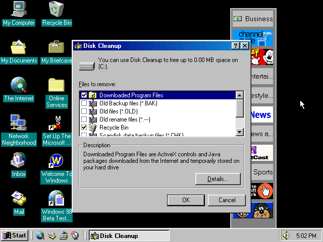
Turns out, the Disk Cleanup utility did exist in build 1559. The interface here is much simpler because it has been accessed through the Tune-Up wizard, whereas opening the dialog from a drive properties window or the file itself tells a different story.
Disk Cleanup also appears as early as build 1525 (or 1526 depending on compile dates) if you search for CLEANMGR.EXE in the Windows folder. Its icon was merely just a generic computer graphic with a wrench which persisted up to 1546.
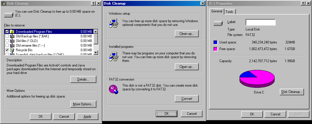
Drive property windows now display a Disk Cleanup... button proudly next to the pie chart, which opens a more descriptive prompt to the right. Cicking More Options... brings up a list of other methods of cleaning/saving up space on the disk. The rest should be self-explanatory, although one oversight is that the FAT32 conversion option is shown as available even though the disk already is in that format.
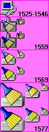
One other interesting thing to note about Disk Cleanup is its icon: it underwent changes relatively quickly, being that its first appearance has a different icon from later builds. In build 1559, it consisted of a brush and a dustpan, while in 1569, the dustpan was replaced with a drive icon. It should be noted that a larger variant of the icon with the dustpan had a checkerboard pattern for the bristles of the brush, and they were later changed to lines for accurate determination. This implies that at first, the smaller variants had a separate artist create a larger representation of that icon, but didn't take into account drawing more skeuomorphic details to reflect those real world objects. In build 1577, the lighting and palette of the icons were altered, in addition to now having an extra large icon.
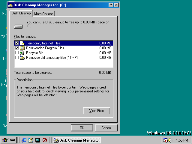
For quick comparison, here is what the utility looks like in build 1577. The main difference here is that both windows have been combined into one as their own separate tabs, and the FAT32 option acknowledges that the selected drive is already in that file format. It is overall identical to the one in 1569 save for some icons and key listed items being removed.