Author: Blue Horizon
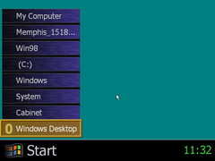
First, I want to demonstrate a unique feature present in builds 1511 through 1525 of Memphis, since it refuses to be ignored. What you're seeing is a cut shell replacement for the desktop that Microsoft nicknames the "Entertainment Shell". This was likely meant to coincide with TV Viewer (later renamed to WebTV) in some way. It's very basic in its functionality too; as the start 'button' is only a static image, and the clock is non-interactive. The menu displays currently minimized windows, as well as an option to revert back to the traditional desktop.
entertainmentshell-FD94A.avi (MP4)
And here it is in action. This component isn't listed anywhere in any INF files, so you have to manually extract the following files from the CD to the System folder in order for it to work: eshell.exe from Win9X37.cab, shlhook.dll from Win9X33.cab, and esdata.dll from Win9X24.cab. Probably a good thing this got scrapped later in development.
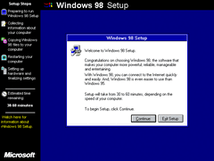
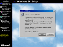
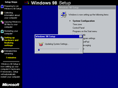
The welcome message at the start of setup has been finalized in this build. Weather its really easier to use than Windows 95 is debatable, though a certain someone would disagree with that statement.
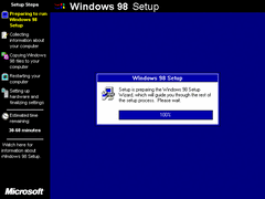
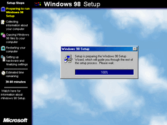
Likewise, the preparing setup dialog has also changed, though its differences are minor and have to be sought after-such as the word "now" being removed, and "Setup" being lowercase.
The setup slides also remain unchanged from build 1546, so I'll skip those over.
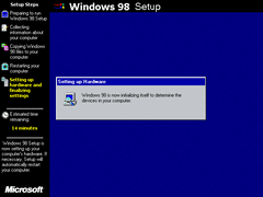
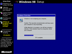
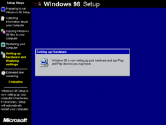
More references to Memphis have been replaced with its finalized name. The hardware detection dialog has also been changed in some spots: "WARNING" has been replaced with "Caution" - alongside the sentence being reworded, and the last sentence has been shortened.
The "Updating System Settings..." dialog now has the famous animated drum icon instead of a computer icon seen previously. You might also notice that dithered gradient title bars aren't present anymore, which I'll get to in a moment.
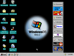
On first boot, the desktop has clearly undergone some changes since last time; notably that the active desktop background is now enabled - featuring a new graphic in the same vein as the boot splash and in early NT 5.0 builds, as well as the channel bar being present by default (albeit missing some assets). There's also a new mail icon both on the desktop where the Recycle Bin usually was, and in the quick launch toolbar.
One other minor change is that the webpage shortcut on the desktop now reads "Windows 98" instead of "Memphis".
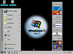
The banner in the start menu has strangely been reverted to using the previous "Memphis" branding instead of the 98 banner seen in 1546.
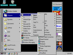
Right click menus in the start menu are introduced in this build, with the menu borders being chunkier around the edges, and main menu items being slightly more separated. This seems to be something more exhaustive to IE4 than in succeeding versions. Needless to say, its really inconsistent. It took us a belated "Second Edition" release for the start menu to return to a more compact form from 95...
One-click (underlined) icons are enabled by default in this build, and hovering the pointer over an icon for a second automatically highlights it. I actually like the idea of single clicking icons, but not the way Microsoft did it with underlining absolutely everything. It's also a feature that feels like Windows was never designed for it to begin with.
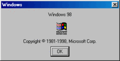
Winver now has its final branding and date set in place.
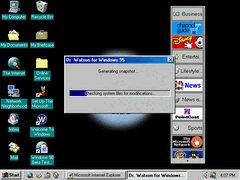
Dr. Watson still refers to itself as the Windows 95 version, and retains the same design since all the way back in build 1353.
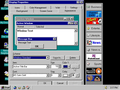
The use of gradient title bars is no longer permitted within the confines of anything below 16-bit colors, effectively removing the dithering effect it has. There probably is a way to restore this functionality under more primitive video modes, as I seem to recall a demonstration not long ago somewhere showing it is possible.
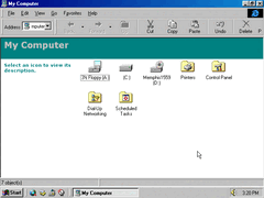
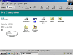
Explorer uses the webby page style by default to define common directories such as 'My Computer' and 'My Documents'. Highlighting a drive icon for example displays a pie chart showing how much space is left, and visually appears identical like in the retail product.
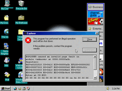
The instabilities and unpolished nature of the operating system are starting to seep through...
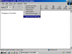
Attempting to view the about dialog in Internet Explorer is broken and thus doesn't work. Perhaps its trying to display the newer webby dialog which hasn't been fully polished yet in its functionality.
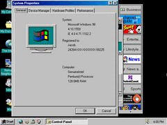
The version number is still viewable through system properties, though.
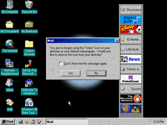
When opening Outlook Express, it asks to remove the Mail icon from the desktop should it be present. Wouldn't surprise me if Microsoft did a similar thing with IE if it asked you to remove Netscape shortcuts.
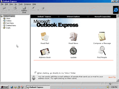
The program itself has been given a face lift, now using design tropes that later versions of Outlook Express would utilize - as opposed to the Outlook 97 style. The most notable change being the sidebar featuring a more compact and organized design akin to that of the explorer directories sidebar.
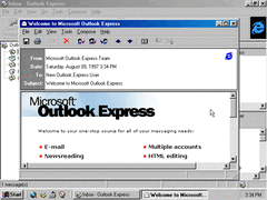
This version of OE includes a welcome message.
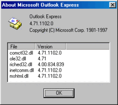
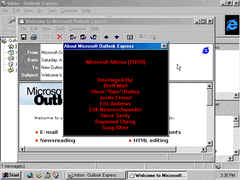
This easter egg was discovered a while back: Selecting one of the files listed in the about dialog and then typing "MORTIMER" reveals the product team credits. With certain video drivers, the credits will display a rainbow effect when scrolling. Coincidentally, this is also reportedly the last build to feature this hidden egg.
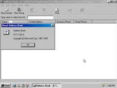
Address Book also features more detailed icons, giving them more of a shinier "3D" look that Windows 98 is aiming for.
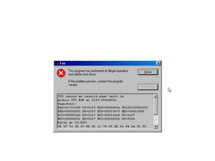
TV Viewer is in a non-working state at this point, with a crash message appearing when attempting to launch it.
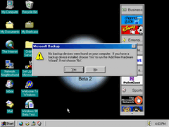
Backup now displays this message when no backup devices are detected.
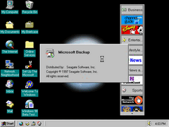
New splash box.
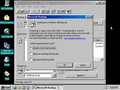
For the record; this was also in build 1546 as well, though that was getting to be a long exploration as it is I didn't stumble across it. Anyway, the program now features a welcome dialog that references Windows 98. I also spot a typo in that first sentence: "A backup is a copy of your file or files."
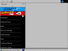
The channel bar in IE looks different visually besides the lack of graphics, and the graphics that are present are oddly stretched.
